
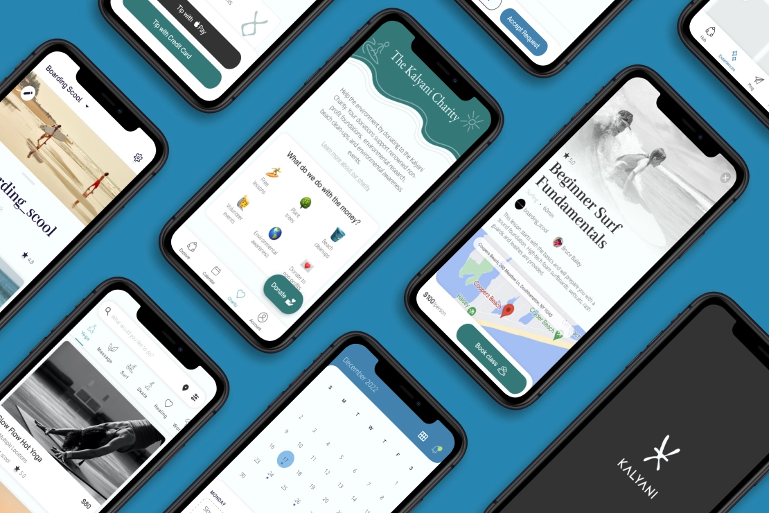
Kalyani is a community-driven platform that connects wellness enthusiasts, empowering members to heal themselves and the planet.
The overall mission is to foster a healthy lifestyle community that gives back. So whether you're a yogi, surfer, or just have a passion for adventure, Kalyani inspires you to explore the outdoors and improve your wellbeing, all while making a positive impact on the environment and supporting small local businesses.
With the app, members can easily discover guided experiences, book private lessons, and connect with like-minded individuals. On top of that, Kalyani facilitates donations through an embedded charity system—aiming to make charity easy, accessible, and eventually habitual for all their users.
I worked directly with the founder to build the MVP for a limited beta launch. For the first release, we designed a foundational marketplace platform, coupled with a business management platform for the instructor clients.
As a direct result of the coronavirus pandemic, more workers are entering the gig economy than ever before. Not only is there an increased demand for gig workers to home-deliver necessities to consumers, but the crisis has also upended the traditional 9-5 working world and caused many employees to pursue gig work for additional or even primary income.
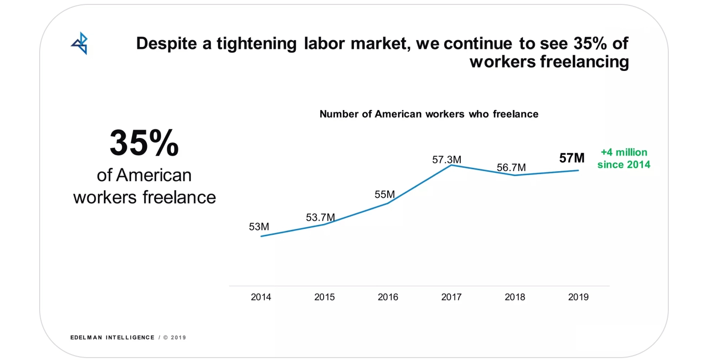
Estimates suggest that gig workers represent around 35% of the U.S. workforce in 2020—a notable 18% increase from 2014. That means roughly 57 million Americans engage in some type of gig work that contributes over $1 trillion to the U.S. economy annually—and those figures are only expected to grow (Upwork, 2019 & MBO Partners, 2019).
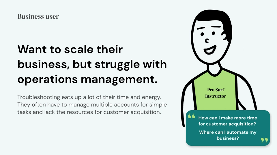
The Kalyani founder, who is part of an established wellness community, has connections to a wide network of highly skilled individuals. Amidst the pandemic, he recognized a common desire amongst them—wanting to monetize their passions, but avoid starting a full-blown company. And for those who already offered their skillsets as a service, he identified a persistent pain point as well—struggling to scale their business, with operations management being the main bottleneck.
As the demand for gig workers continues to rise and create more opportunities, naturally the space is also becoming more competitive. There’s a high need for gig workers to be tech-savvy and stand out even more now.
At the time, there were no ideal solutions that empowered these skilled individuals to take the next step in their business pursuits. Feeling inspired to fulfill this niche need, Kalyani was born. The founder recruited a team to execute on this idea, and I came on board as the lead product designer.
Build an MVP marketplace platform with scheduling infrastructure that will enable independent and small businesses to provide classes and private lessons for individuals who seek guided experiences.
1 location
First release in Hamptons, NY.
Kalyani wellness network
100 instructors with 1,000+ existing clients.
Although there are existing apps which provide health/wellness services and scheduling infrastructure, we found that they were not up to par and lacked the quality standards needed to keep up with the demands of today’s users.
Competitor weaknesses
• Buggy/laggy app - leading to lack of trust from users
• Interface is clunky and not user-friendly
• Steep learning curve and time investment for onboarding
• Pricing structure can be too expensive for independent or small businesses
Identifying these weaknesses was crucial for us to build a product that is substantially better than what exists today, and ensuring product-market fit. These competitor shortcomings were all opportunities for us to improve on and deliver successfully for many unsatisfied users.
To be able to provide as much value as possible with limited resources, we decided to scope down our target audience for the MVP to make competing easier, and aim to solve the problems of specific people before expanding our range.
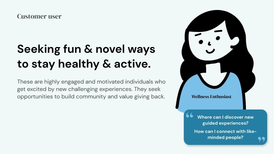
We focused on our established network within the wellness community of the Hamptons—which includes surfers, skaters, yogis, life coaches, martial artists, and beyond. We sorted them into 2 user categories: wellness enthusiasts and pro instructors. Wellness enthusiasts would represent our customer users while pro instructors would represent our business users. Through comprehensive user interviews, we gained deep insights into their unique attitudes, needs, and desires.
After getting to know our target users, we knew we wanted our product to demonstrate these core values:
Cultivate Connection
Encourage authenticity and community building. Messaging should feel human.
Foster Exploration
Language and content should inspire self discovery and evoke a sense of adventure.
Promote Giving Back
Empower users to donate, volunteer, and pay it forward.
Be Reliable
Guarantee security, maintain consistency, and reduce latency.
Be Intuitive
Anticipate user needs, utilizing signifiers and proper visual hierarchy.
Keep It Simple
Optimize complex ideas and actions for easy understanding and efficiency.
Specifying these principles not only helped us to prioritize the core features for the MVP, but also served as north star metrics for us to define success.
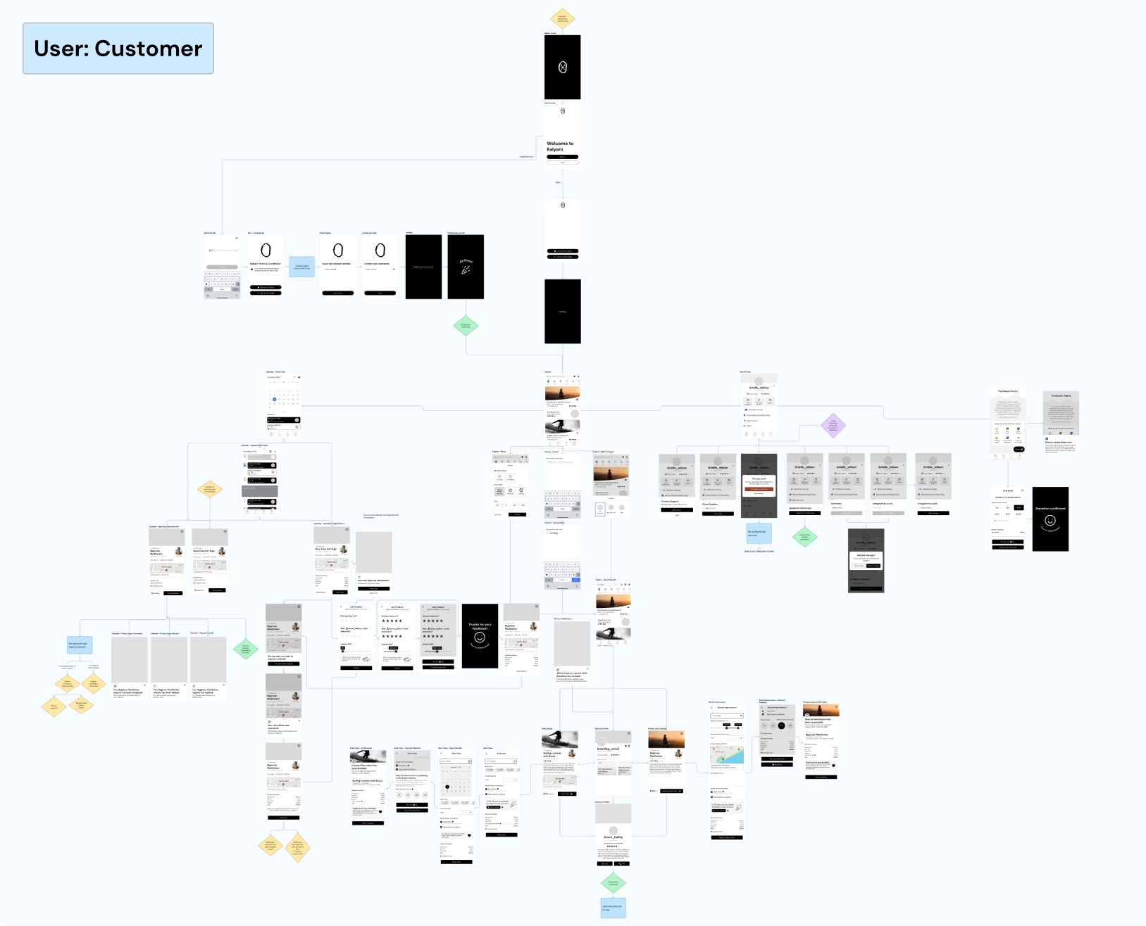
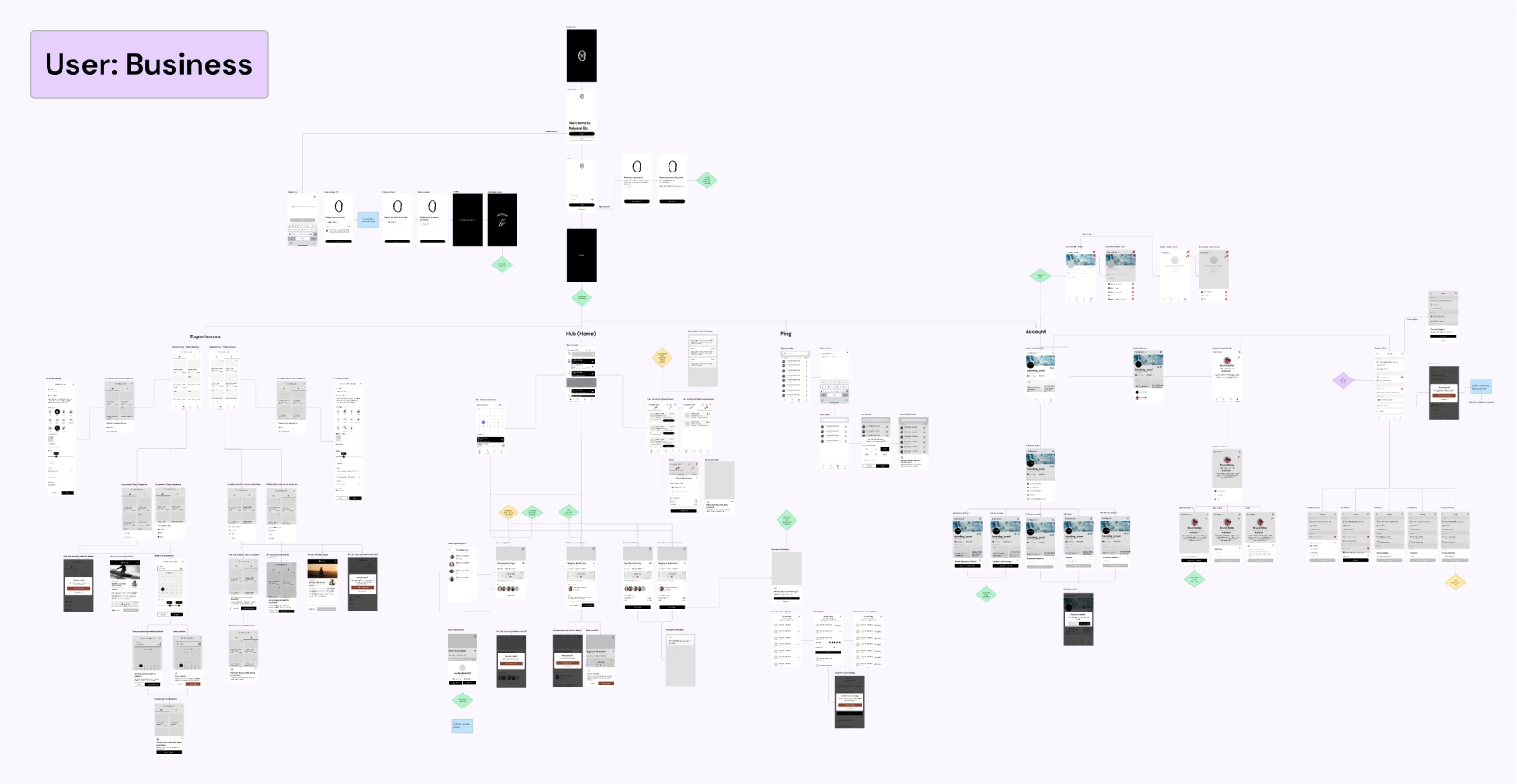
Before jumping into any designs, we created sitemaps to plan out the structure and information architecture of Kalyani, which we later updated with actual wireframe screens to aid development in building out the app.
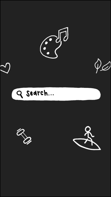
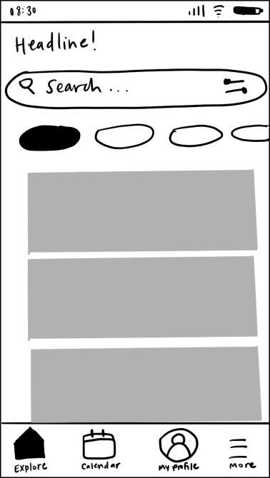
To kick off our exploration phase, I sketched out some initial ideas for the explore page, which would serve as the app’s home screen.


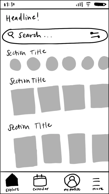
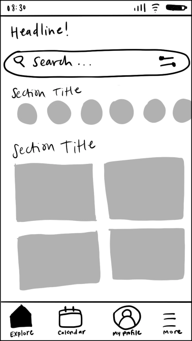
Although it is inevitable to encounter different ways of thinking within teams, the clashing opinions throughout this project was particularly challenging to overcome because of the unique nature of the project: the founder was also the lead engineer. Since he was the one building the product, he had specific preconceived visions and felt very strongly attached to them. Our design team often found ourselves with our backs against the wall when it came to design decisions.
For example, with the home screen explorations mentioned above, the founder already had his mind set on a specific direction—the simple route. He wanted the home screen to be ambiguous, with nothing other than a search bar because it felt exclusive and exciting. Although a cool concept, we identified some questions and blocks that our users might face:
• What kind of experiences are even offered?
• How do I discover what’s new?
• I’m not sure what I’m looking for yet, I just want to browse.
So we proposed also exploring a second direction: a dynamic feed approach that improved discoverability and still encouraged exploration by browsing. We thought it might be beneficial to provide a little guidance, especially for first-time users that were unfamiliar with the different Kalyani offerings. However, the founder immediately rejected this because he was so tied to the first direction; it was difficult for him to see any other way. This caused some friction between design and dev.
As designers, our approach should always be to listen and consider all POVs. It is our job to explore different solutions and narrow down the best possible fit. So, even though we disagreed with the founder’s single-minded viewpoint, we still mocked up several variations of his desired direction. At the same time, we mocked up some options of this second proposed direction. Being able to see the two options side by side visually helped us to convey the pros and cons of each. We carefully explained our rationale behind the direction we were pushing for, drawing everything back to our core principles.
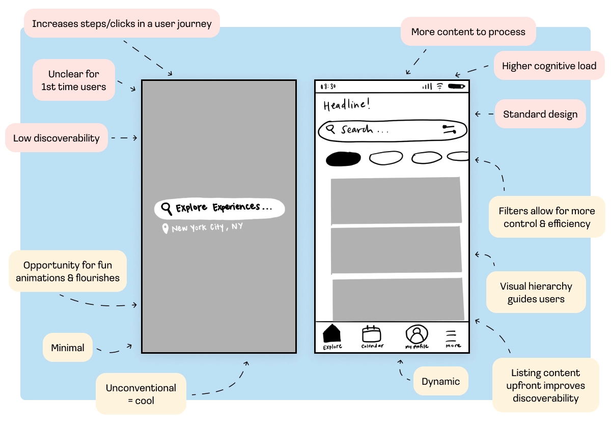
Which decision supports the intentions that we set in the beginning? When we approached disagreements this way, it helped break through biases and push the needle forward. Not only did we end up with the most optimal user-friendly solutions, but we also garnered respect and trust from the dev team at the end of the day.
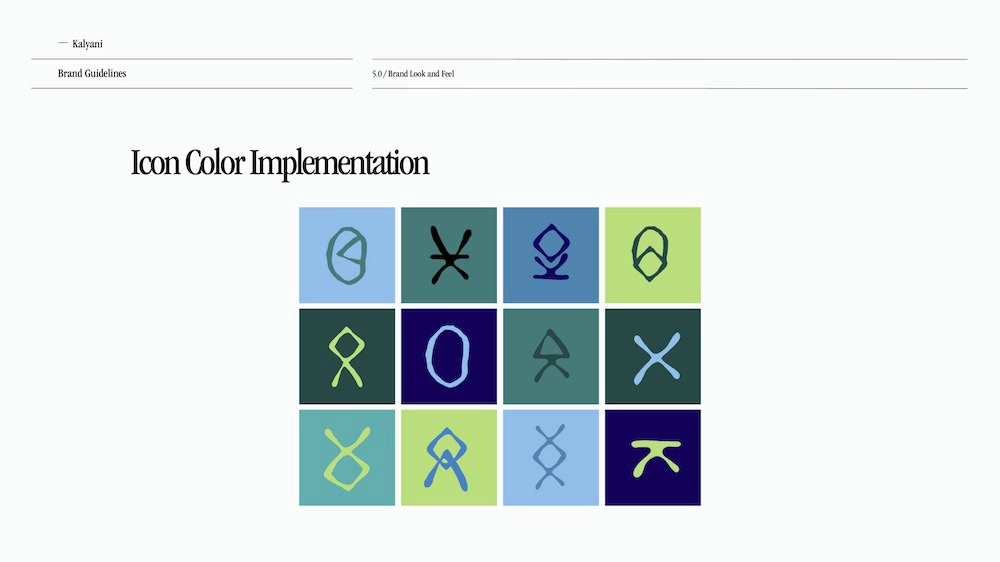
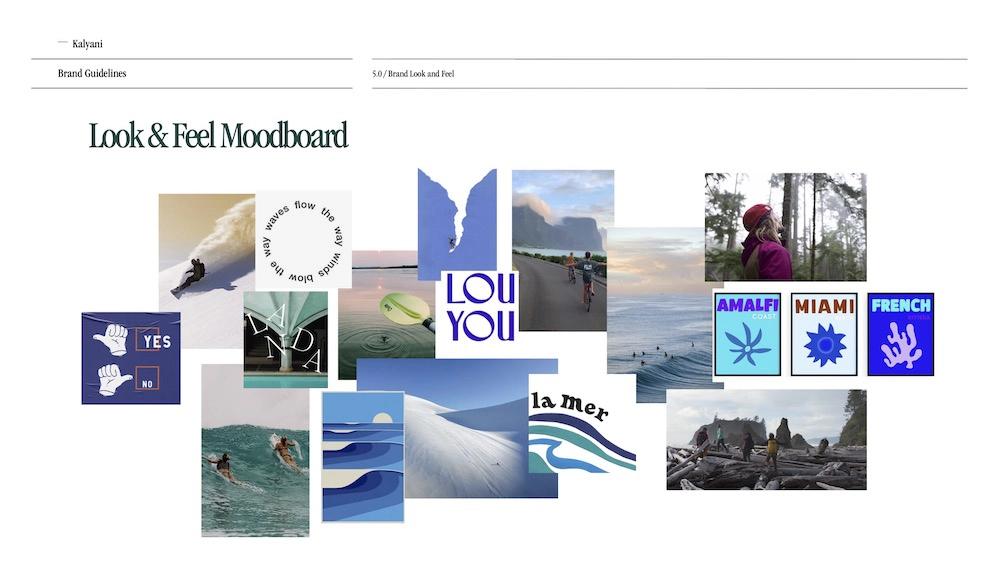
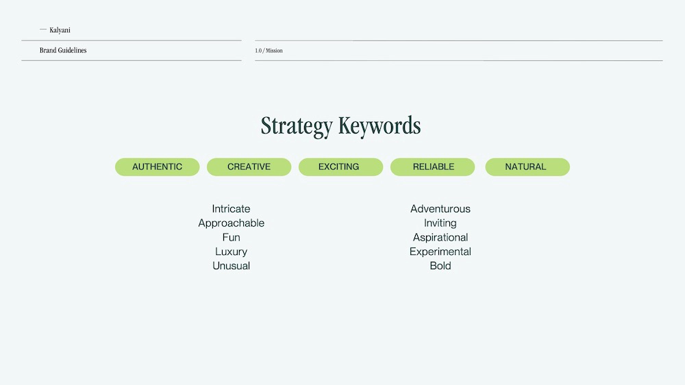
We worked with a brand designer to nail down the branding & identity for Kalyani. Together we developed specific guidelines that helped us stay consistent and power through the UI phase efficiently.
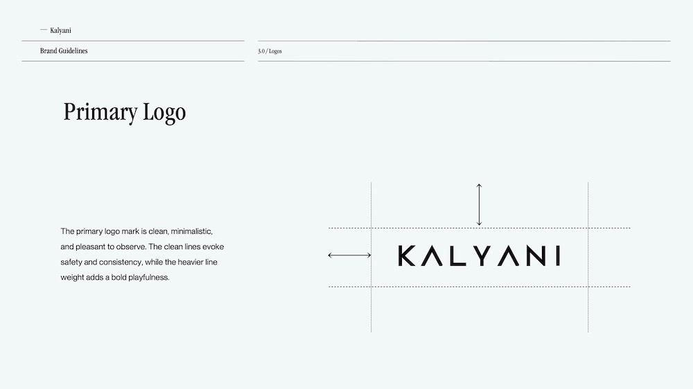
Now, let’s walk through how our members use Kalyani!
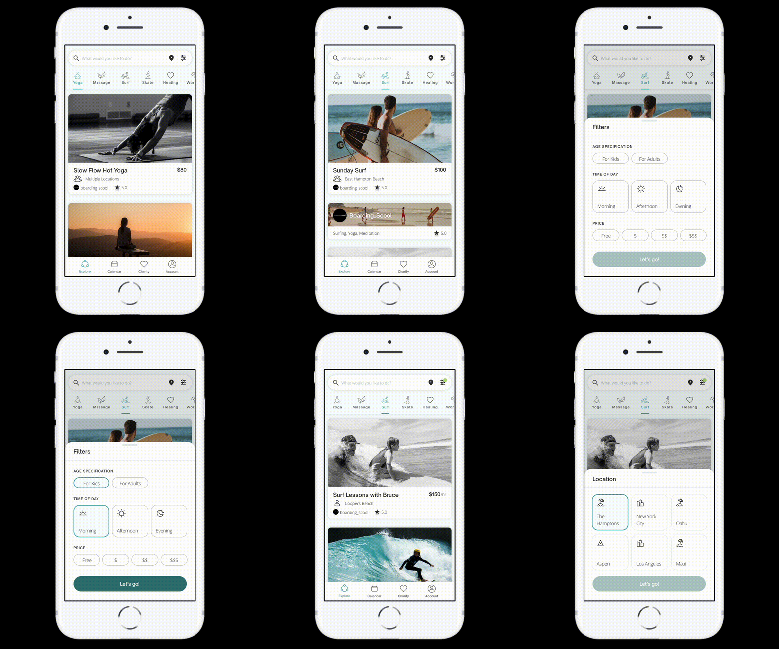
• Explore a diverse range of experiences, suitable for all ages and skill levels
• Browse efficiently with filters
• Flexibly switch to any other participating location
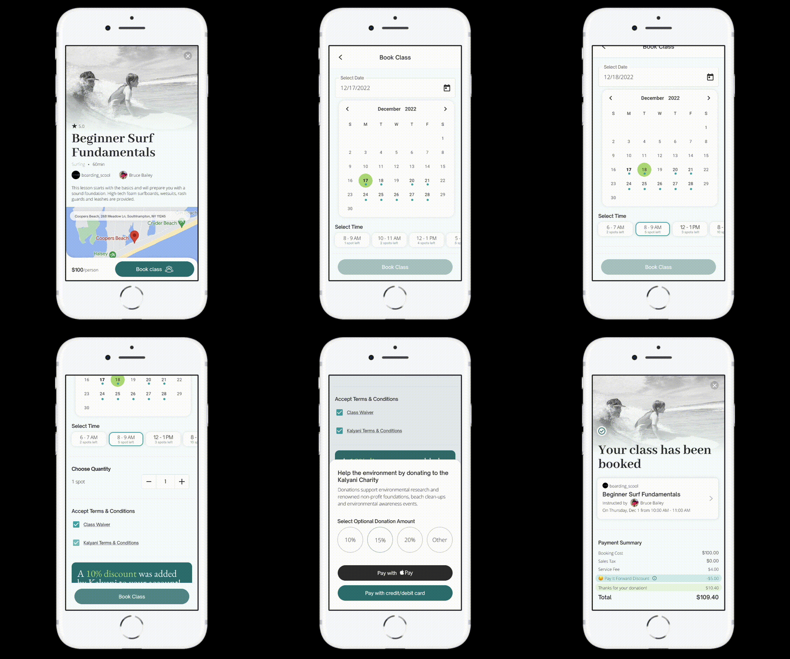
• Make reservations for just you or an entire group
• Expedite the onboarding process by tackling terms & waivers within the transaction flow
• Confirm payment via Apple Pay or credit/debit card

• Easily access the donation screen via the main nav
• Give to the Kalyani Charity (supports nonprofits, volunteer events, environmental research, awareness)
• Learn more about how you can help the environment
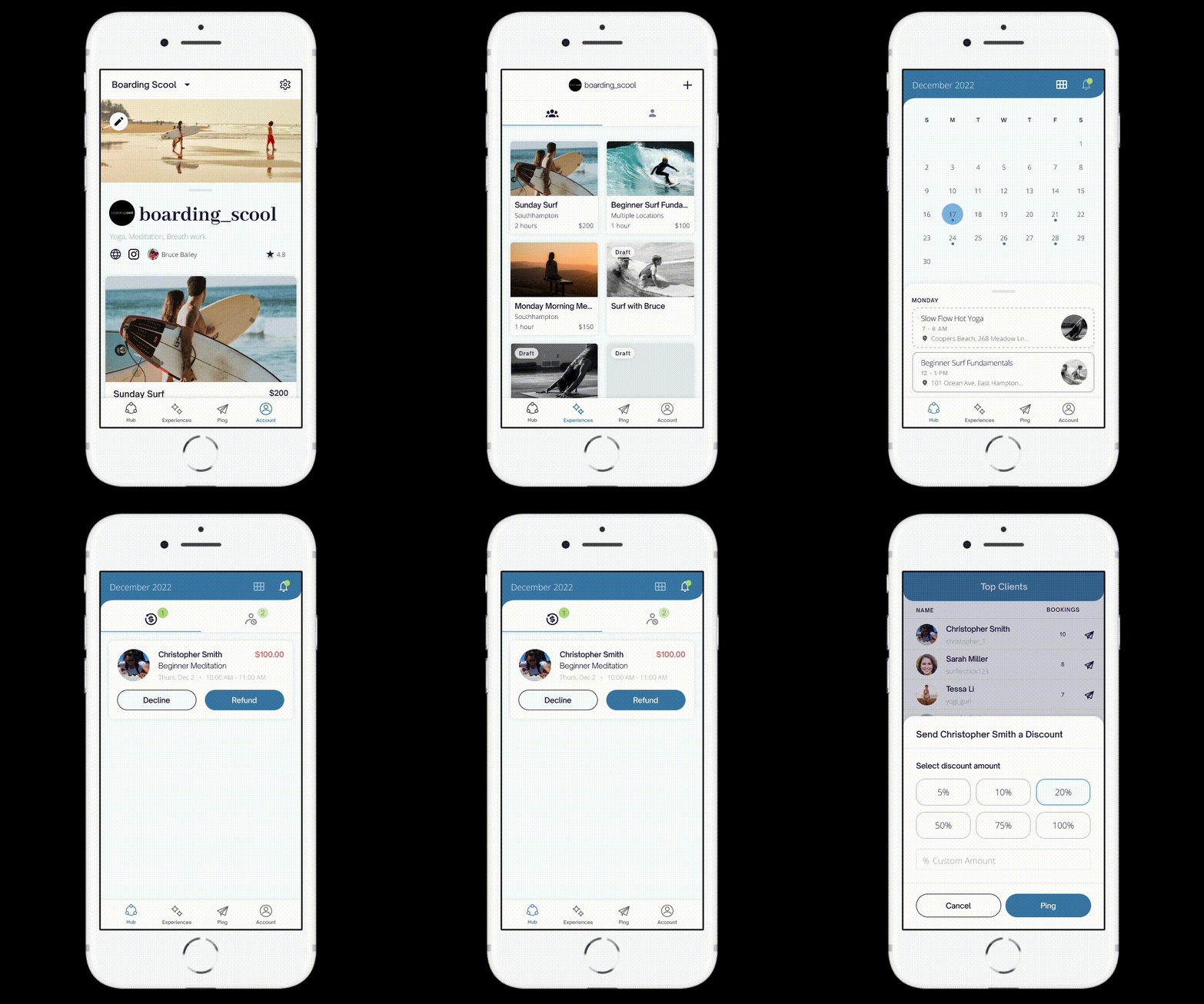
Business management platform
• Simplify processes, automate repetitive tasks, and improve efficiency
• Manage your bookings, payments, and class offerings
• Reduce customer acquisition costs by gaining access to our wide network of clients
• Retain more clients by fostering relationships
🌐 Expand network - support more locations in CA, HI, CO, and FL
🛍 Add a merchandise marketplace
🤝 Strategic partnerships with athletic and outdoor brands
📱 Optimize experience and integrated features (Shopify, weather alerts, Quickbooks)
Through the challenges I encountered in this project, it forced me to face one of my biggest fears: conflict. As a naturally conflict-avoidant person, my strengths include adaptability and working well with others. But on the flip side... this has also led me to suffer from people-pleasing and self-doubt.
Being in extreme cases of conflict this project has taught me that it’s okay (and sometimes even necessary) to rock the boat. It’s crucial to ask questions and challenge some decisions. It’s important to fight for what I believe in, while still maintaining a healthy detachment from the end result and a lack of ego.
I’ve since learned how to approach conflict in a productive and constructive way, and in return, it’s made me a much stronger designer, collaborator, and leader.
Founder / Software Engineer
1 Developer
1 Product Manager
1 Product Designer
1 Brand Designer


