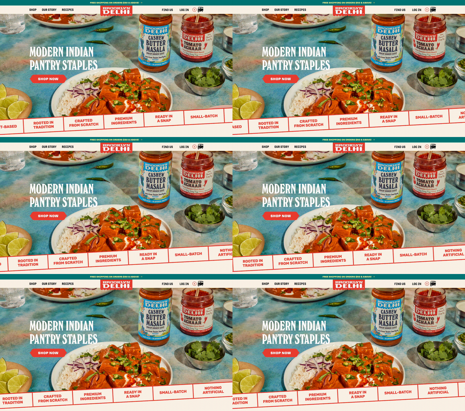
Brooklyn Delhi is a modern CPG food brand that specializes in crafting high-quality Indian sauces & condiments.
Their products were flying off the shelves in grocery stores nationwide and they were now looking to scale their online sales to the same level. But for a brand that is so focused on flavor, their existing website failed to embody that—it was bland and outdated. So we hopped in the kitchen and got cooking. The end result is an optimized website that is as bold & flavorful as their sauces.
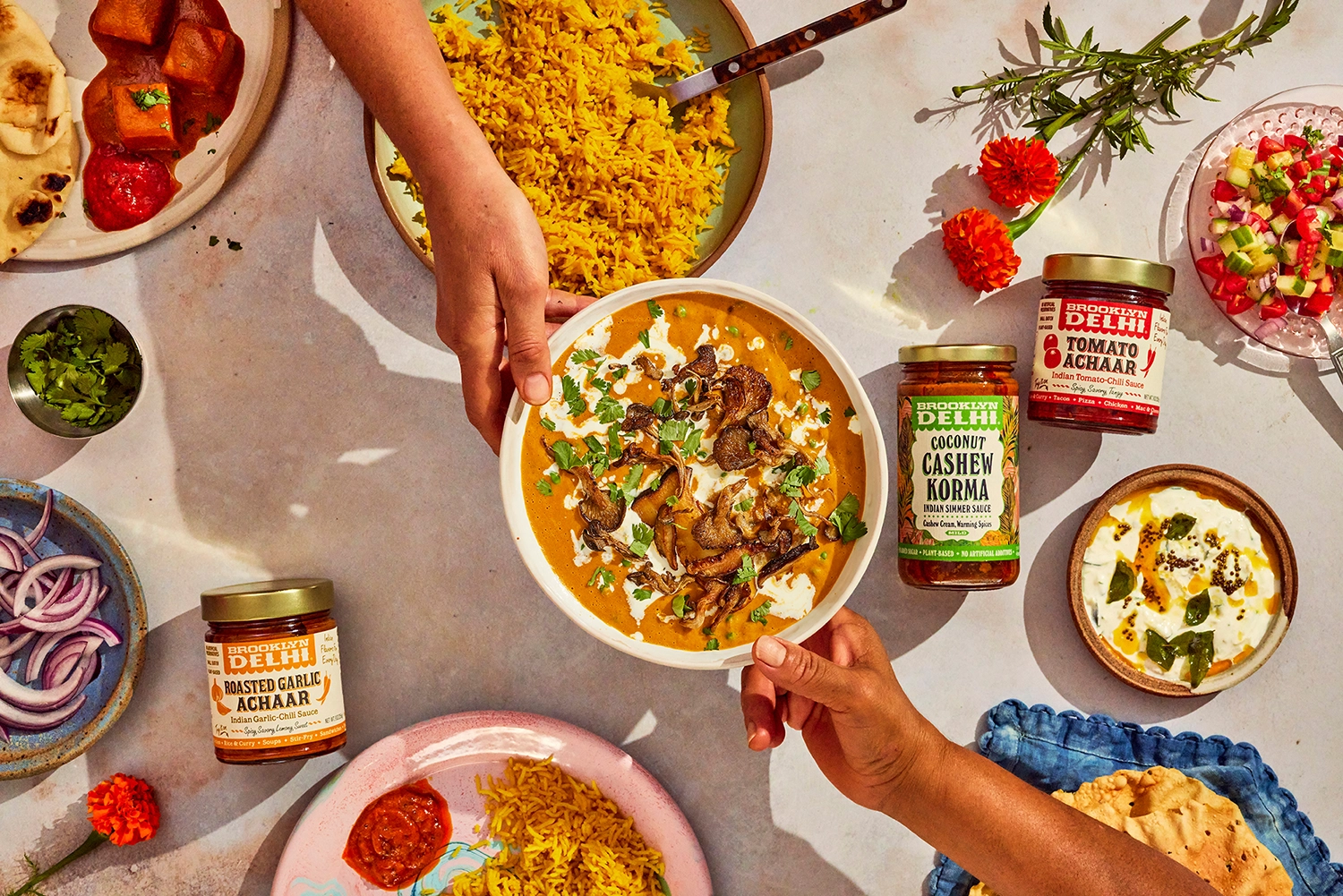
Brooklyn Delhi’s goal is to bridge cultures by connecting people to real deal Indian flavors.
After launching in Brooklyn, New York 8 years ago, they have undoubtedly achieved that, building a reputable brand and gaining loyal customers among food enthusiasts along the way. But they mainly focused on wholesale, and with the changing grocery landscape, they understood the importance of growing their D2C arm.
So, their next objective was to scale their business and capture the e-comm space. To do that, they needed an elevated and refreshed website that represented the quality and richness of their products.
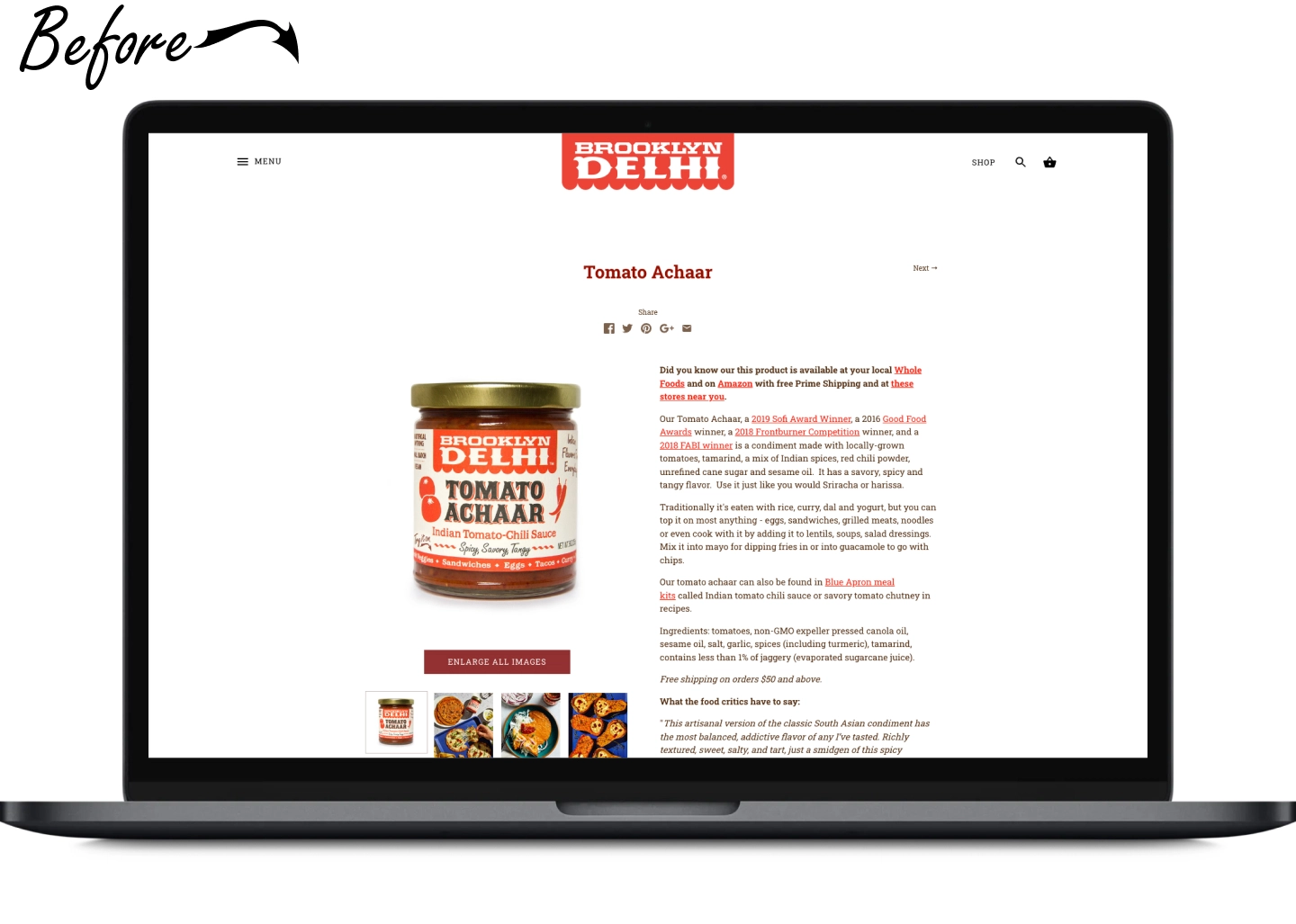
Brooklyn Delhi’s existing e-commerce website was neglected to say the least. It suffered from an outdated design and lacked the personality needed to truly represent this exciting brand.
It also had several usability issues, including slow page loading times, a hidden navigation, legibility and color contrast issues, and overall high cognitive load. These problems were resulting in a high bounce rate and low conversion rates, affecting the brand's online sales and digital presence.
🎨 Enhance visual appeal: Design a modern website that reflects the brand's premium quality
📖 Tell a story: Effectively communicate the brand ethos, history, and personality
🏗 Improve website structure: Build a discoverable navigation system and scalable sitemap to support their growing product line
😊 Optimize user experience: Address technical issues to reduce page load times, and provide a seamless e-commerce experience by incorporating easy shopping throughout the customer’s journey
📈 Increase conversion rates: Implement strategies to drive more sales and boost average order values
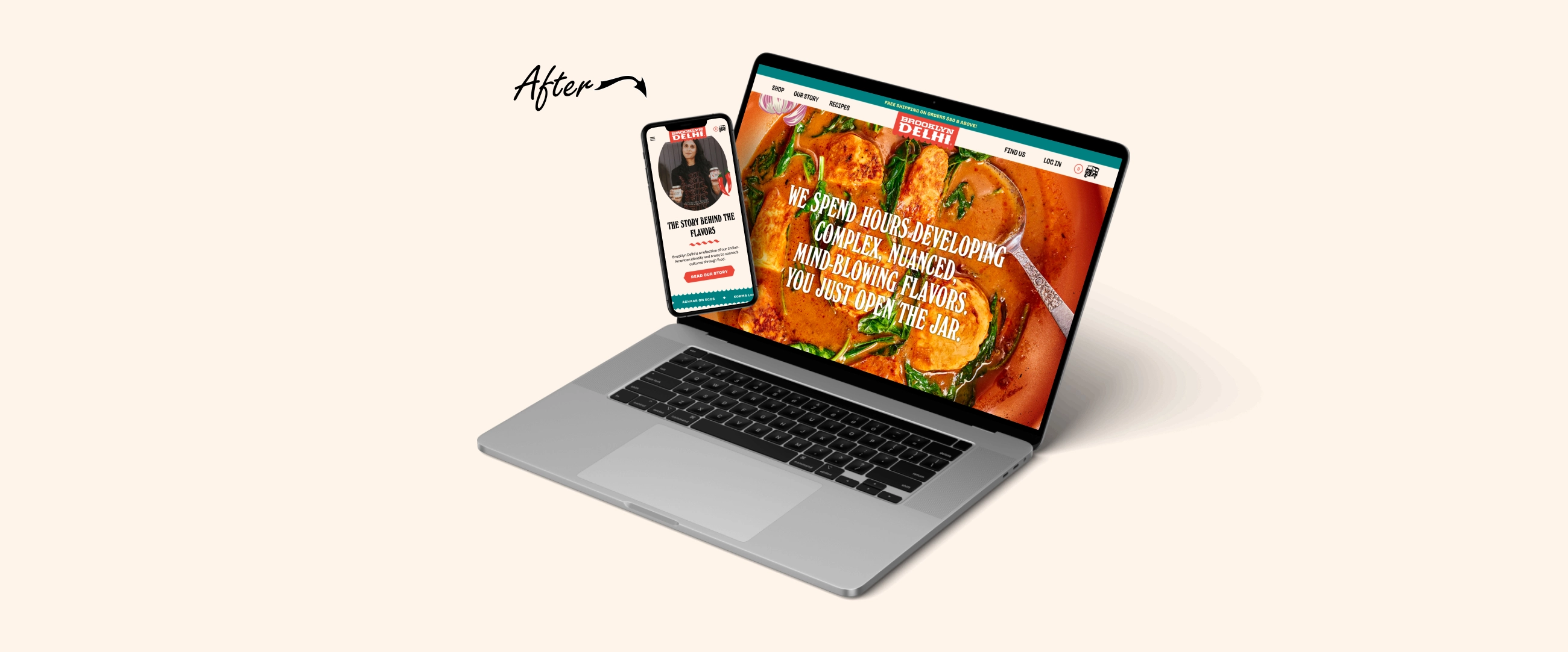
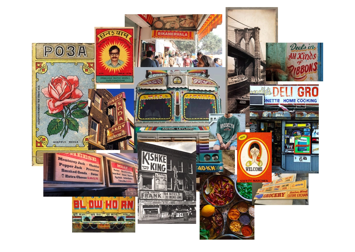
The brand is a reflection of the founder Chitra’s dynamic Indian-American identity and hometown roots in Brooklyn. We wanted to honor that in this redesign by bringing together all these rich cultural elements into one delicious melting pot. This meant drawing inspiration from a wide array of sources—from Indian matchboxes and truck art to NYC bodega storefronts and deli menus.
It was important for the site to feel like a physical space—to evoke the feelings of walking into your local bodega in Brooklyn—so we designed a preloader screen to spark a small moment of delight when you first click into the website.

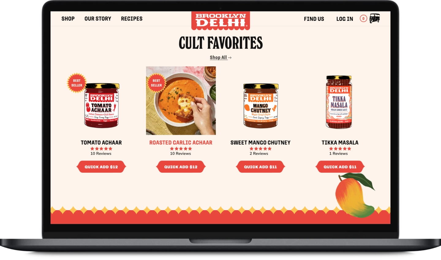
Upon landing in the homepage, you are welcomed with vibrant visuals that ignite your taste buds, punchy messaging that leaves an impression, and bold colors + fonts that pay homage to Indian truck art.
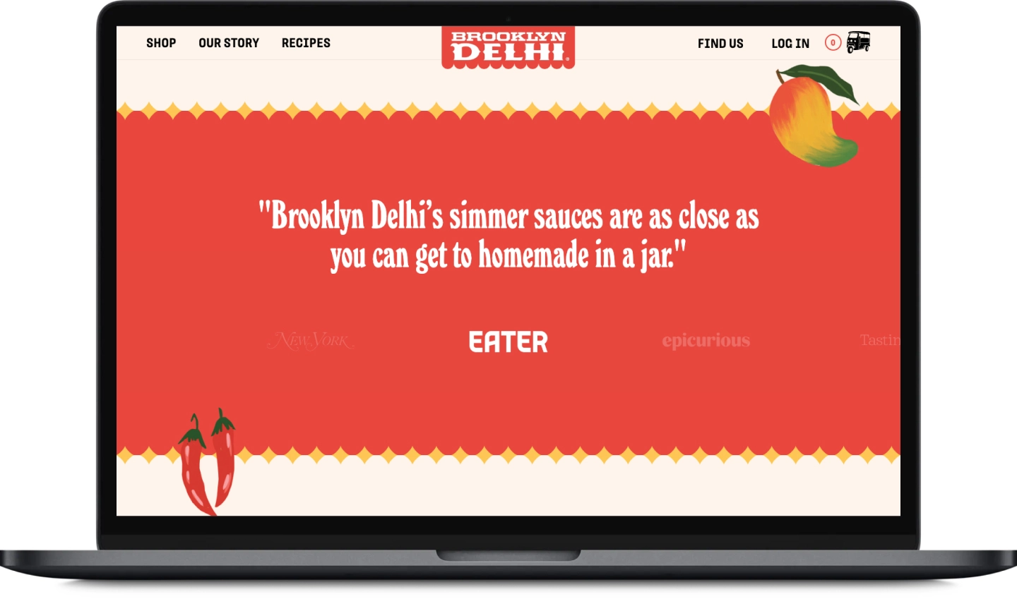
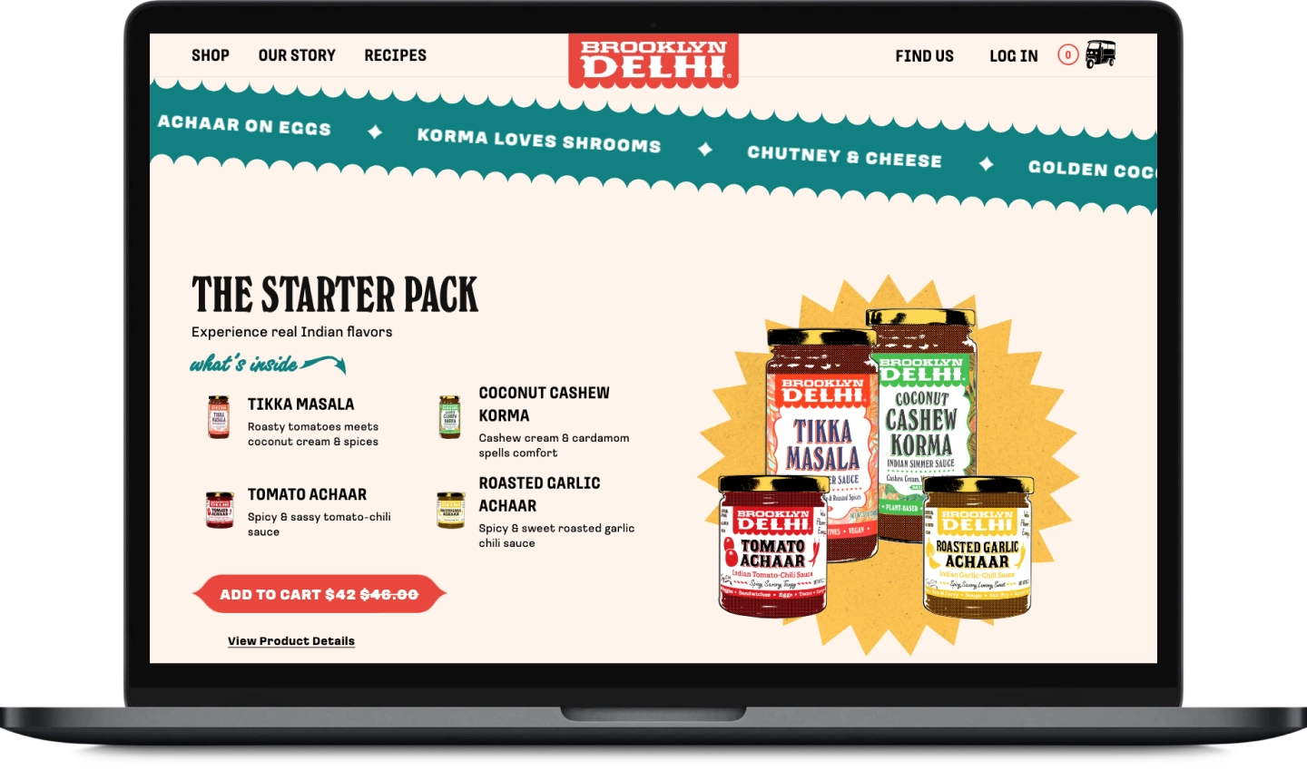
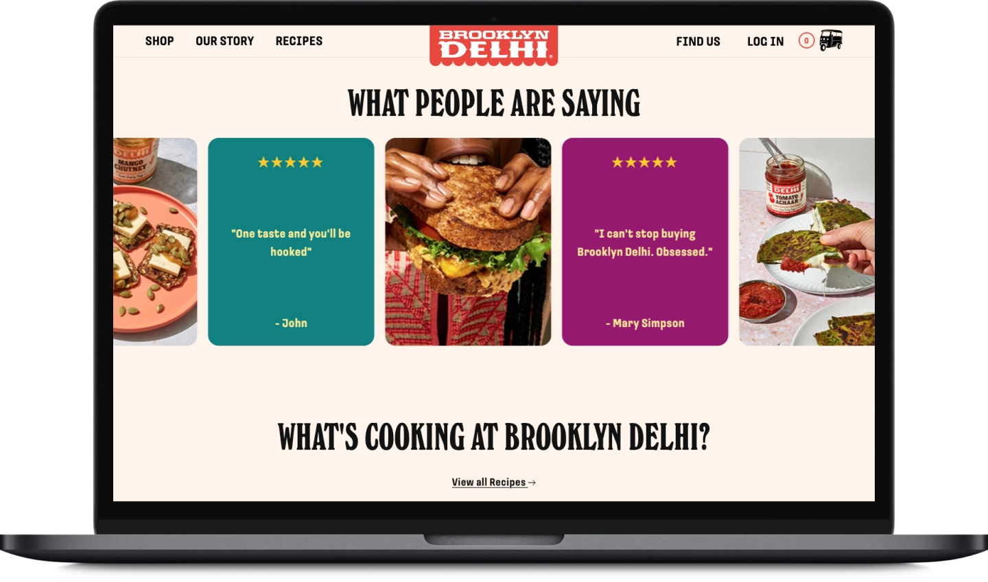
To boost discoverability and ease of browsing, we added a navigation bar that stays fixed to the top of the page at all times. To optimize for e-commerce, we placed a large “Shop Now” CTA button on the banner image above the fold, and listed the most popular products to help guide any first-time customers below that. We also highlighted their recommended bundle product: “The Starter Pack” for those who want the full Brooklyn Delhi experience but don’t know where to start. To further build trust, we spotlighted testimonials & real customer reviews for social proof.
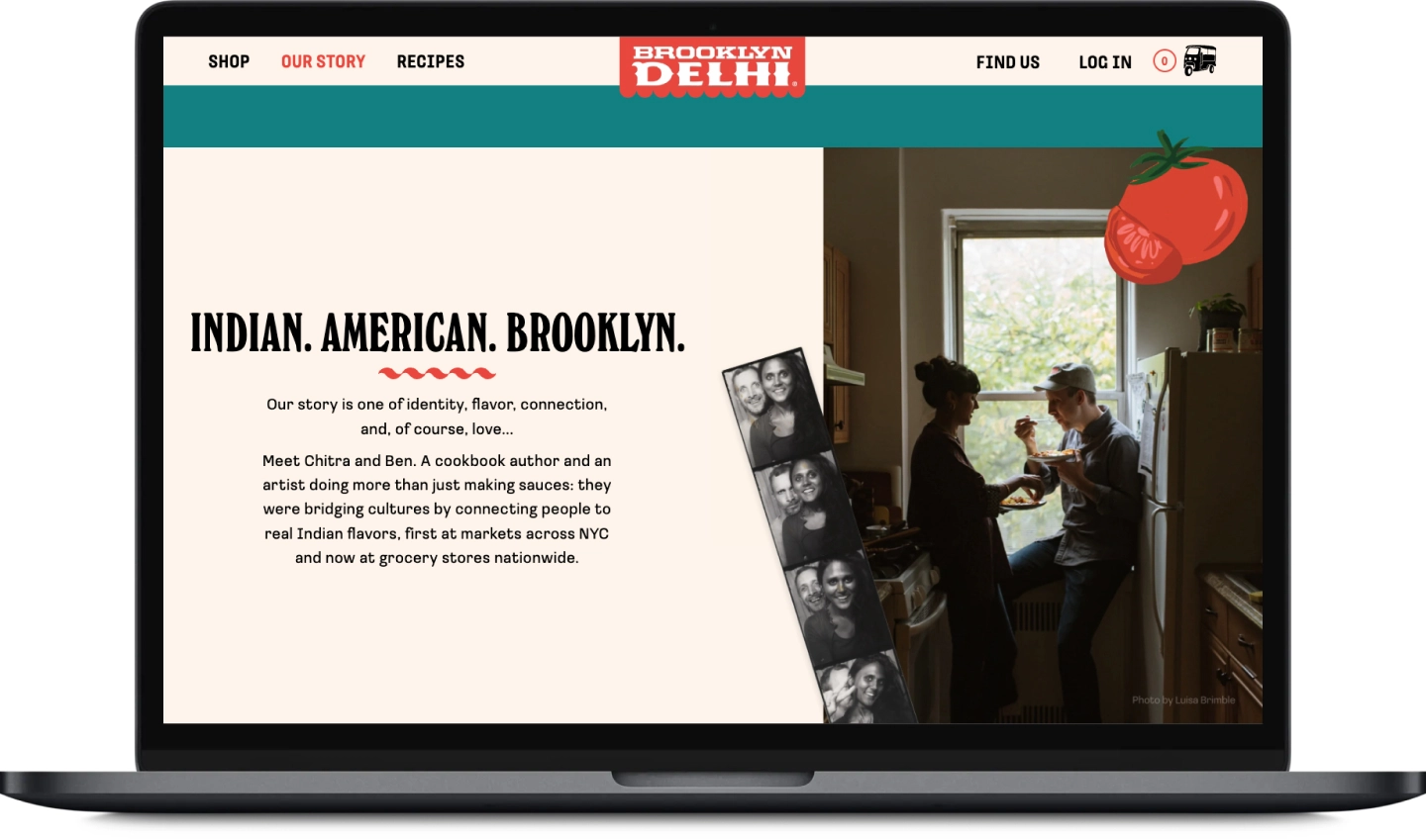
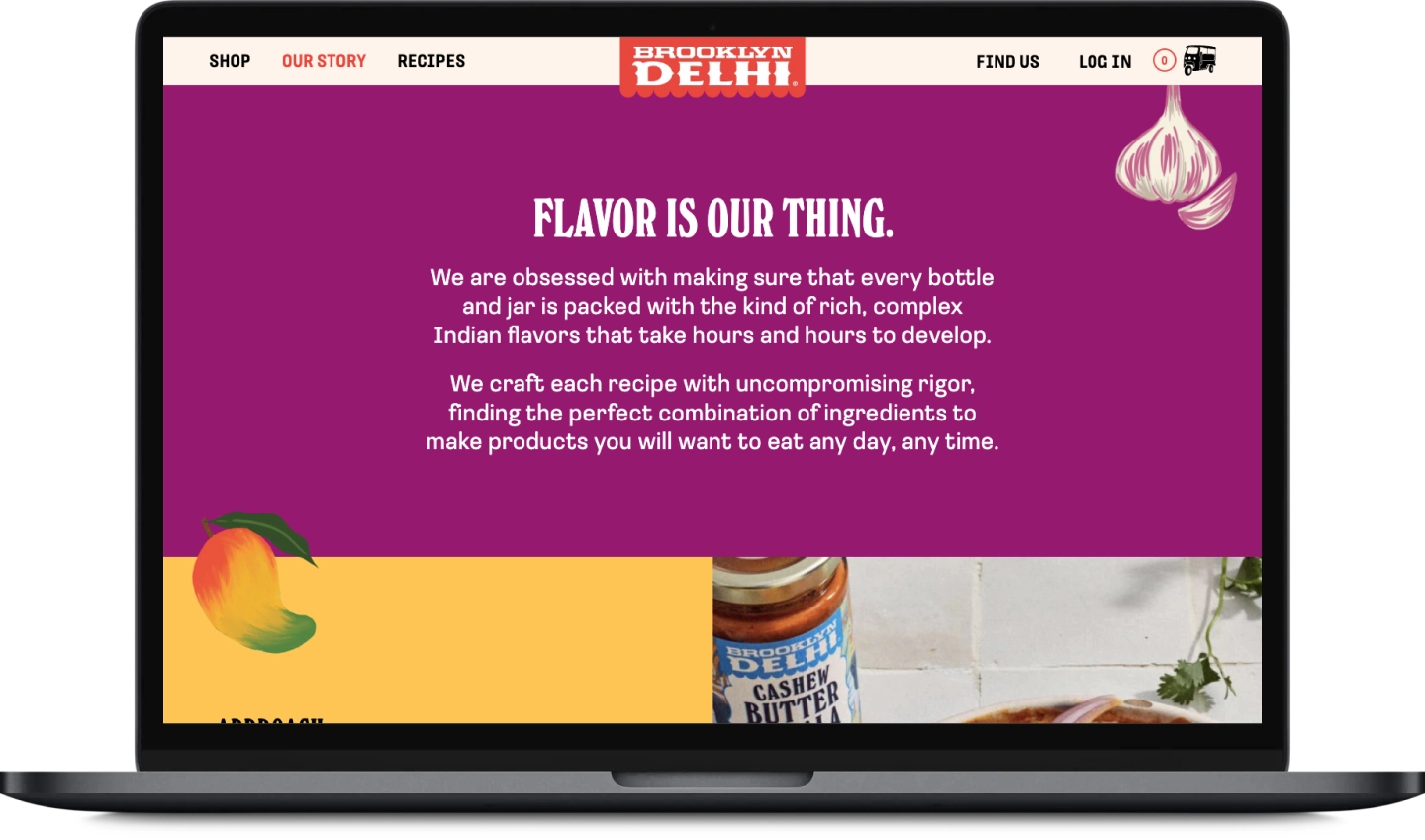
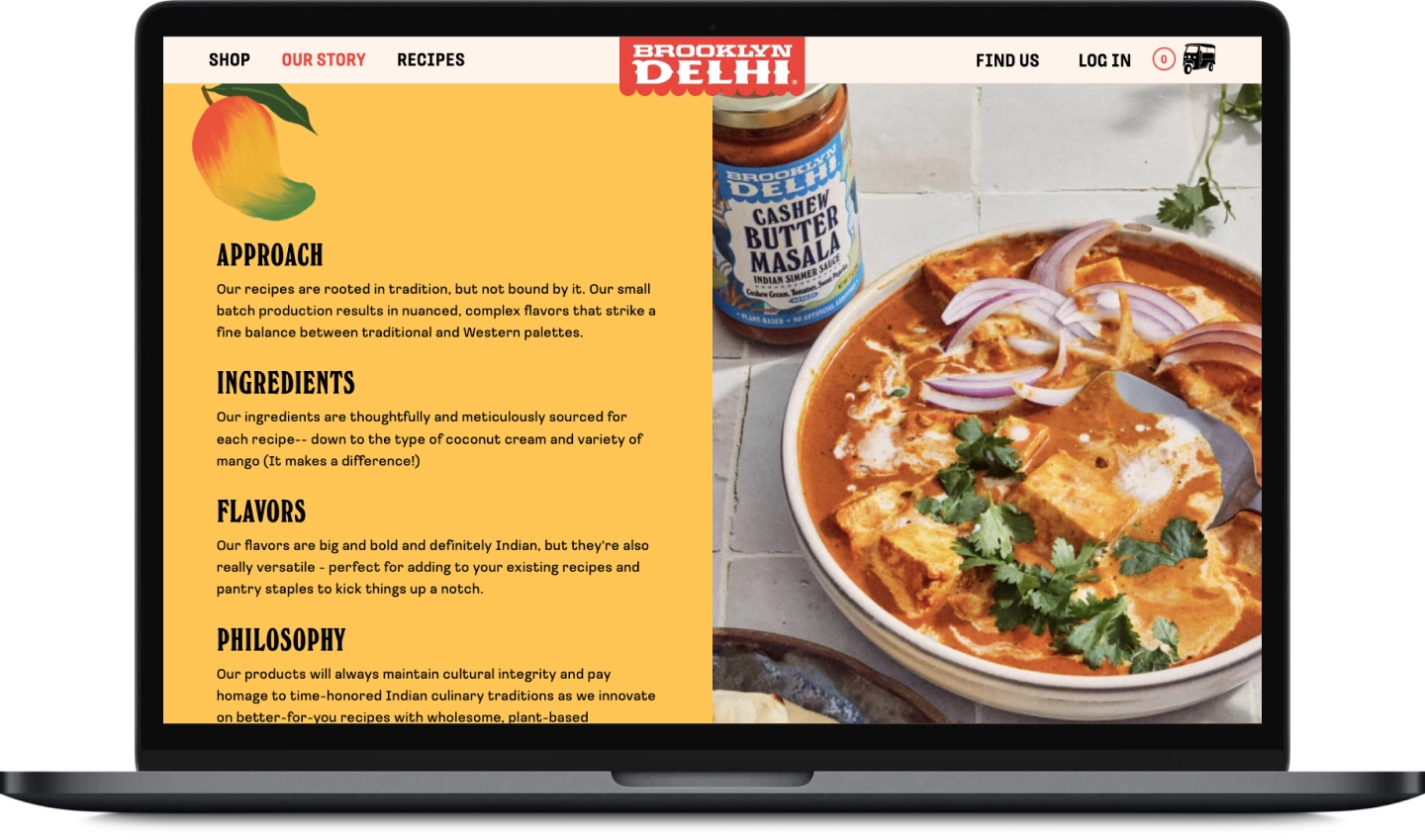
Brooklyn Delhi’s story is one of identity, flavor, connection, and love. This section is the heart & soul of the website so we really focused on engaging storytelling.
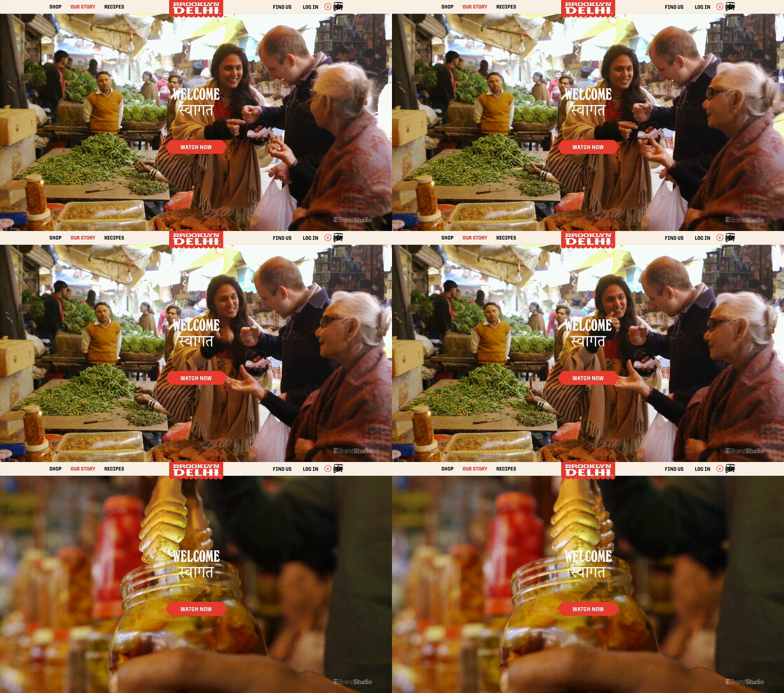
The page opens with a full-screen video highlighting their beginnings as a brand.
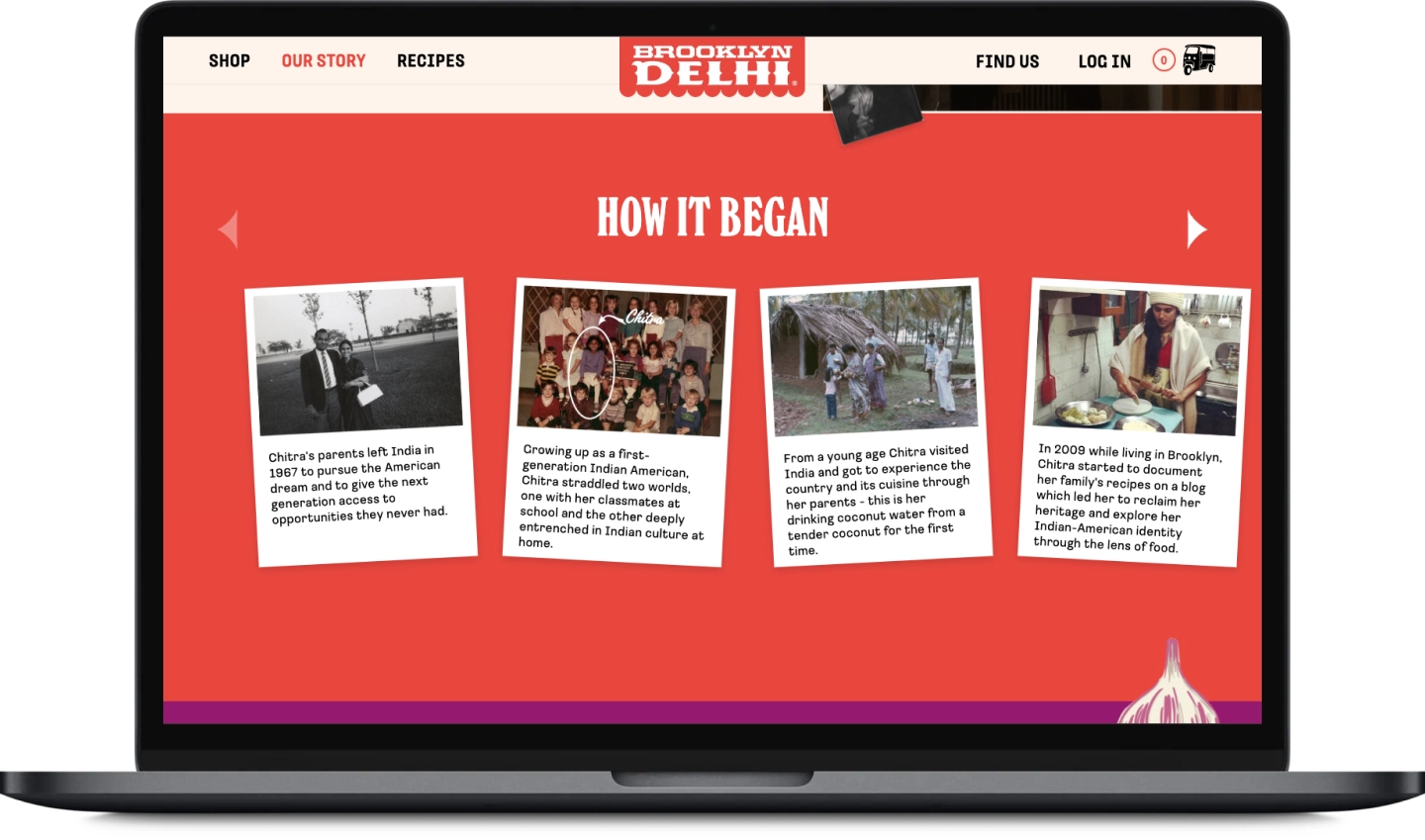
As you scroll down, you are further introduced to the founders, their roots, and how far they’ve come. We wanted to add an intimate touch to truly connect with readers, so we shared personal photos and glimpses into their lives. To bring everything full circle, we conclude this page with really nailing in the Brooklyn Delhi ethos.
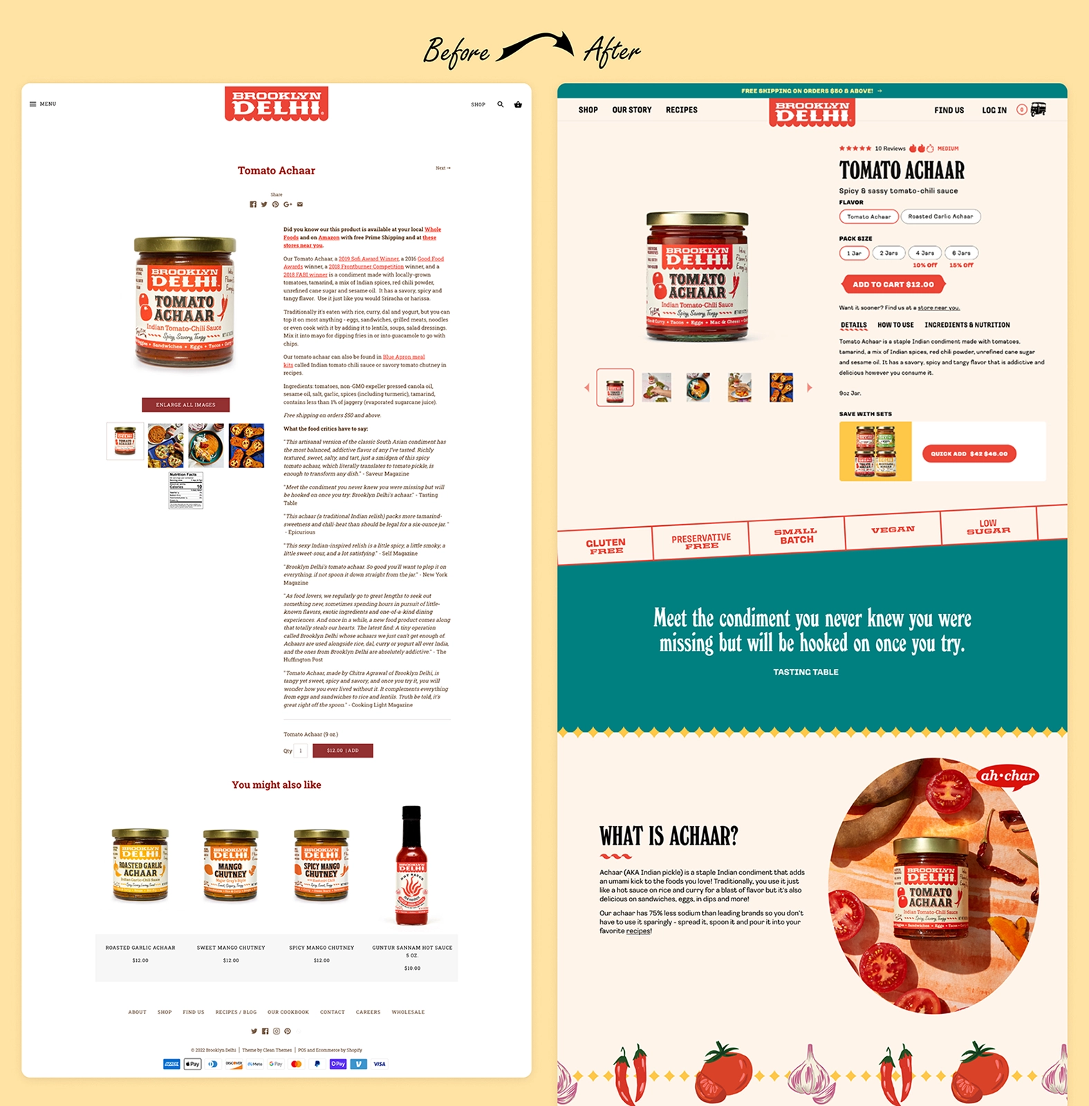
What was previously an overwhelming eyesore (and what looked more like a blog post than a PDP), is now a pleasant and intuitive user experience that is optimized for e-commerce.
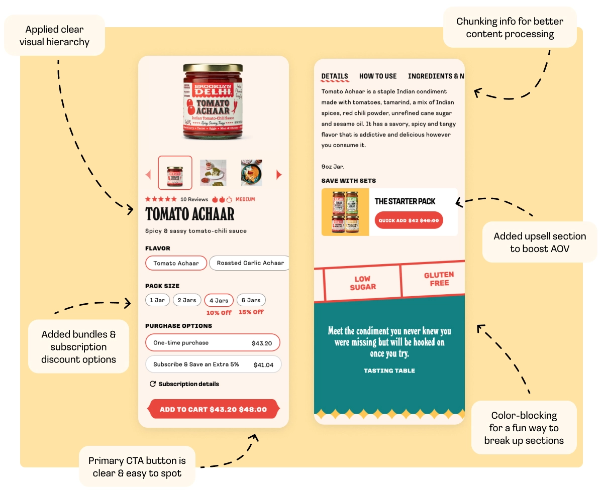
We implemented these strategies to decrease cognitive load and increase conversions:
• Chunking information for better content processing and engagement.
• Applied clear visual hierarchy so users are able to skim and quickly make decisions.
• Created variants to efficiently compare all the flavors and sizes available for a product.
• Added subscription & bundle discount options to raise perceived value.
• Added an upsell section to help boost AOV.
• Increased the size of the CTA button and made it the primary red color so it’s clear and easy to spot.
• Broke up sections in a fun & seamless way by color-blocking and using branded illustrations for dividers.
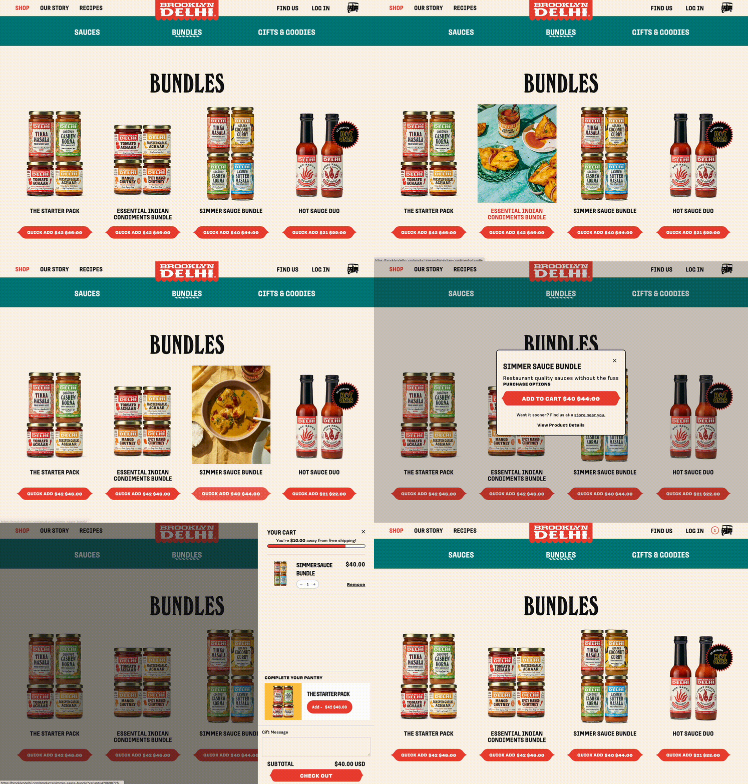
We wanted to incorporate easy shopping at every point throughout the entire browsing experience. We did this by enhancing the product cards, implementing a quick add to cart functionality, and ensuring that the shopping cart is always accessible.
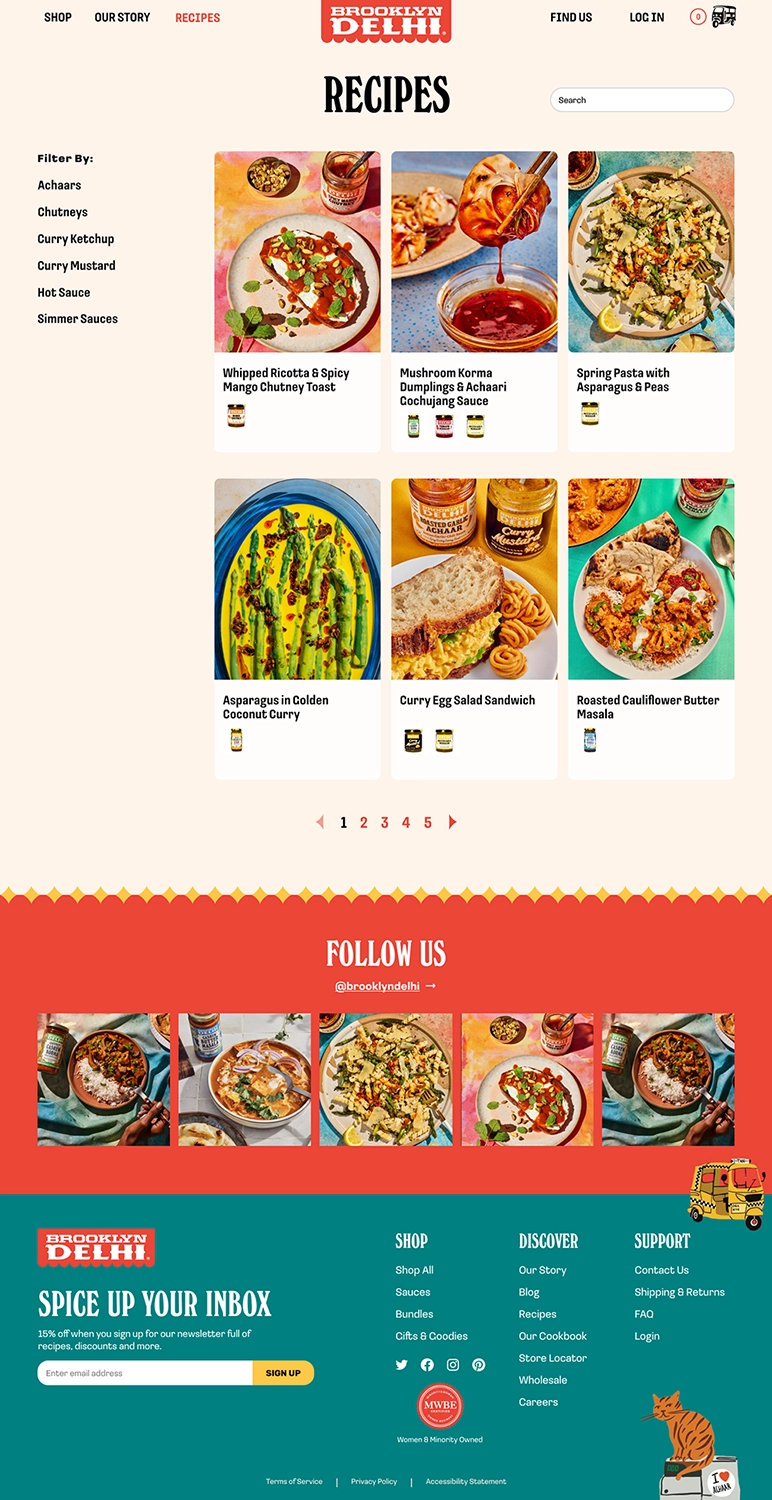
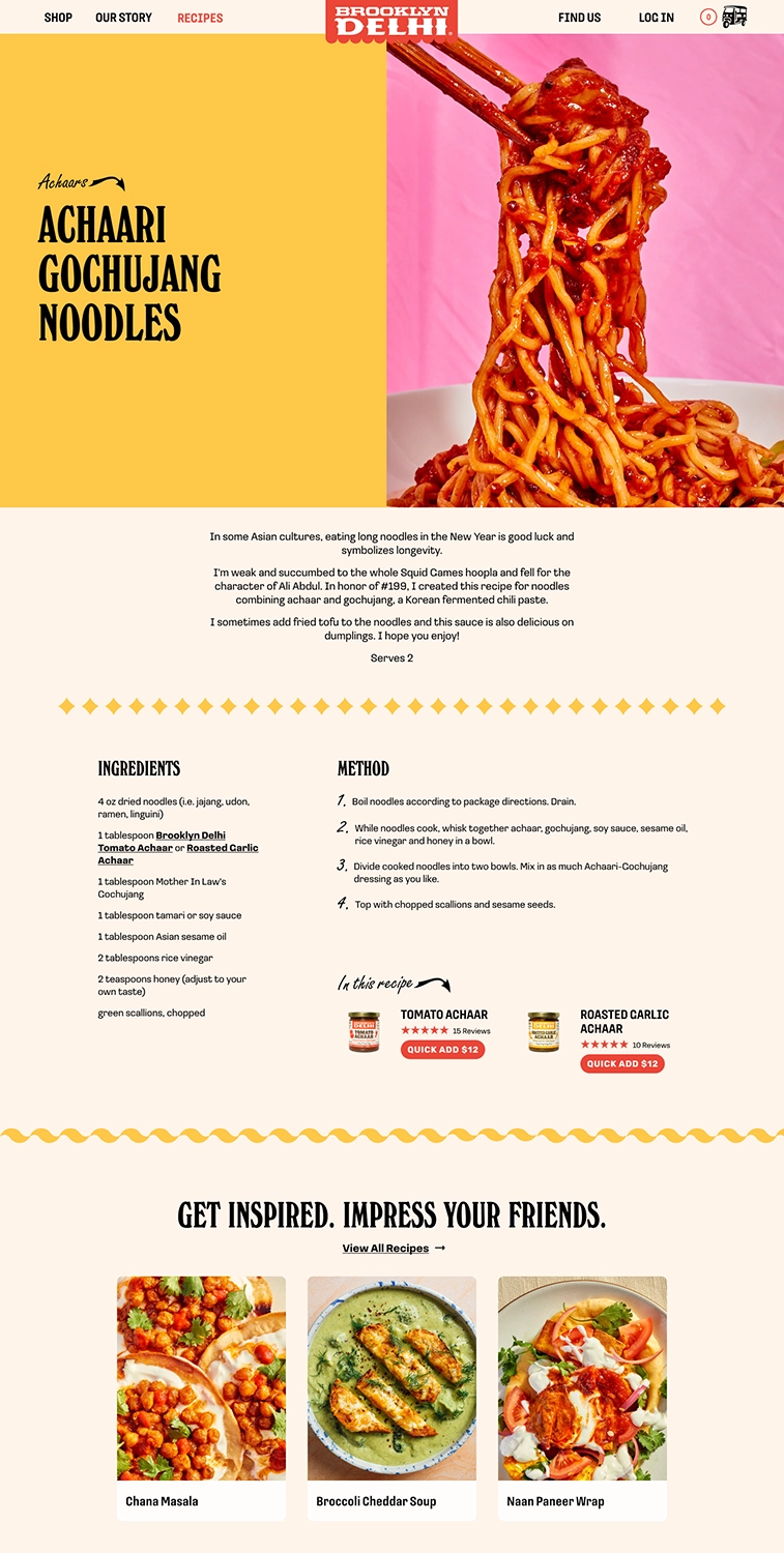
The blog component is the foundation of Brooklyn Delhi and what gives texture to the brand. Previously a neglected area in their original site, we revamped this section to feel relevant and exciting. We made it easy for users to search for recipes specific to certain products, or simply browse and get inspired. Recipes are now also shoppable, allowing users to add all the Brooklyn Delhi ingredients they'll need straight from the recipe page to their cart.
The feedback we received from both the client and their customers was extremely positive, with many expressing that they loved the new look and feel, and it undeniably elevated the brand.
Beyond a boost in positive sentiment, we’ve also seen an increase in engagement on the site, a decrease in page load time, and an increase in AOV during the holiday season as a direct result of this redesign.
Chitra Agrawal, Founder
Ben Garthus, Creative Director
Brielle Wilson, UX/UI Designer
Steph Huynh, UX/UI Designer
Anjali Mehta, Illustrator