
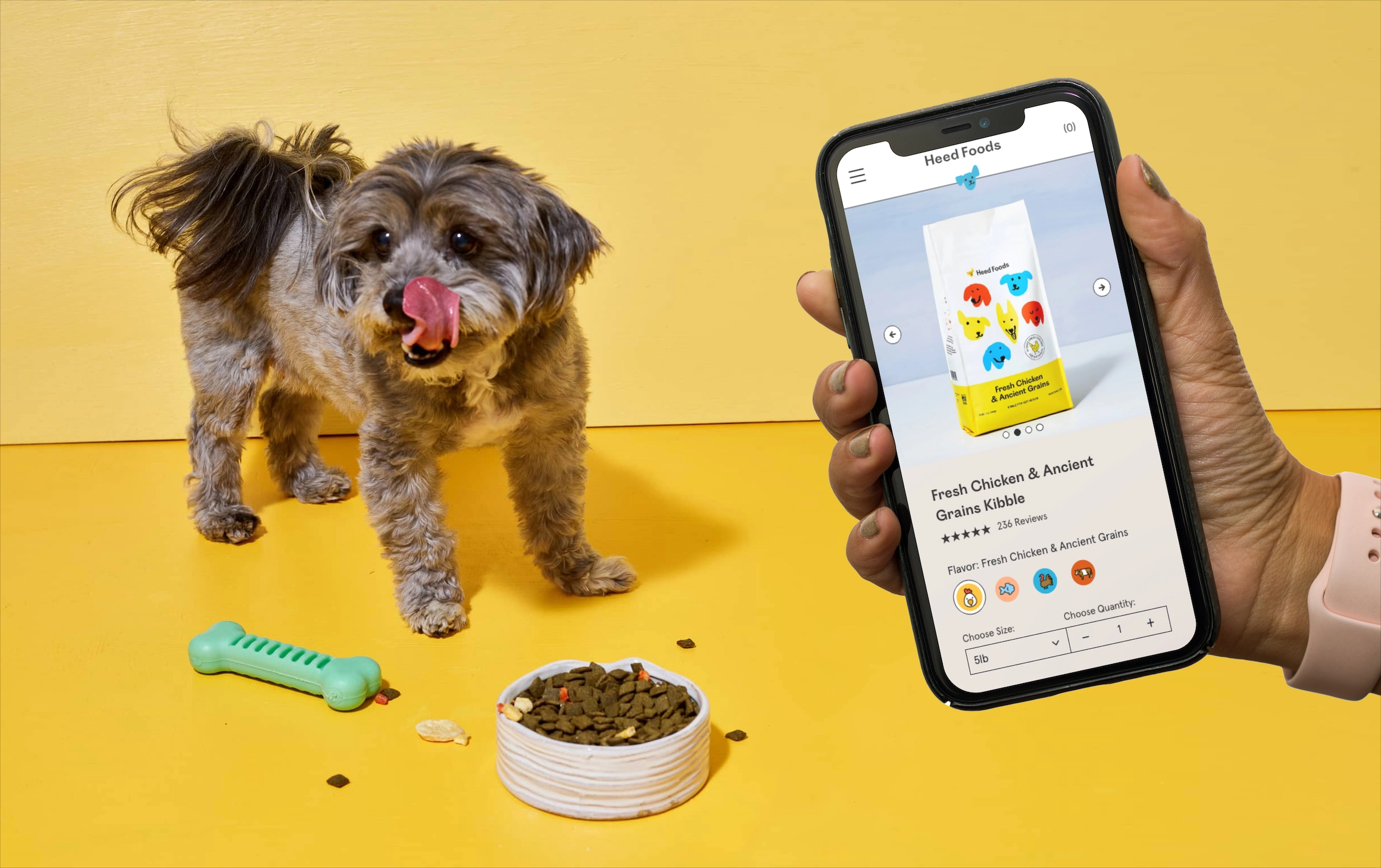
Heed Foods was the only dog food brand focusing on gut health, and backed by proven results—but why were users still bouncing?
We were hired to redesign the Heed Foods website to optimize their e-commerce experience and better communicate the products’ powerful benefits. Our solution presents a dog food brand that’s easily digestible for both pups and pup owners.
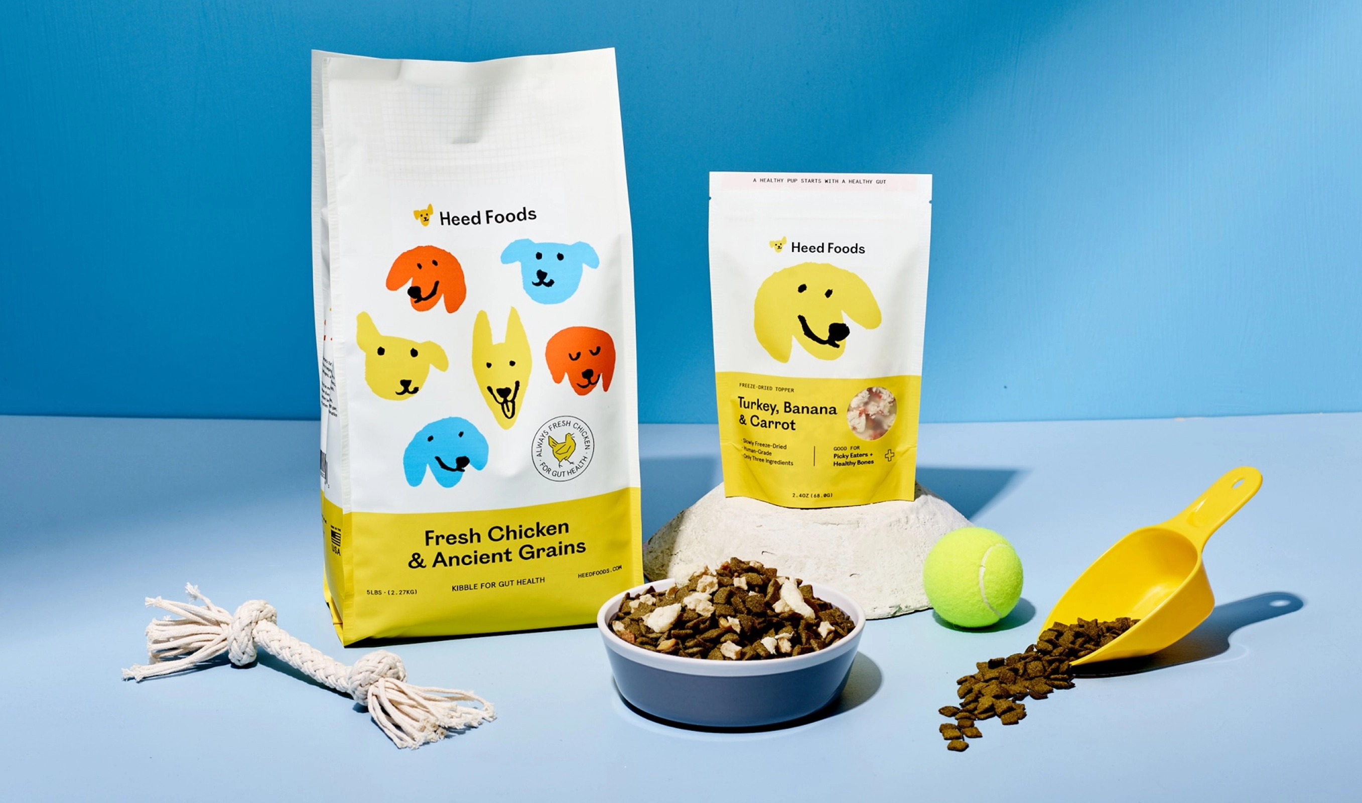
Although eye-catching, the original website was cluttered with too much information and failed to get the main value props across in an effective way. Users would be drawn in by the beautiful branding, but then soon drop off. How might we build a better web experience that successfully converts new visitors to customers?
While the team had their own hypotheses, not everyone was completely aligned. To refrain from moving forward strictly on bias and assumptions, we conducted some rapid research. Because we were on a tight timeline, we focused on three methods that would return the most value in a short amount of time.
• Heat maps: to understand what elements attract users’ attention, what they click on, and how they interact with the current site
• User testing: to help identify usability issues
• A/B testing: to validate design decisions
The Heed Foods team was passionate about their science-backed product, and eager to educate their customers on the importance of doggy gut health. But, they were missing the mark because they were overwhelming new users with excessive information. So instead of connecting with prospective customers like they intended, their website was causing major cognitive overload.
Through our research, we noticed these patterns:
• Users scrolled past text-heavy sections
• Users would miss a lot of components that were not immediately clear to be interactive/clickable
• Users responded best to a more minimal interface
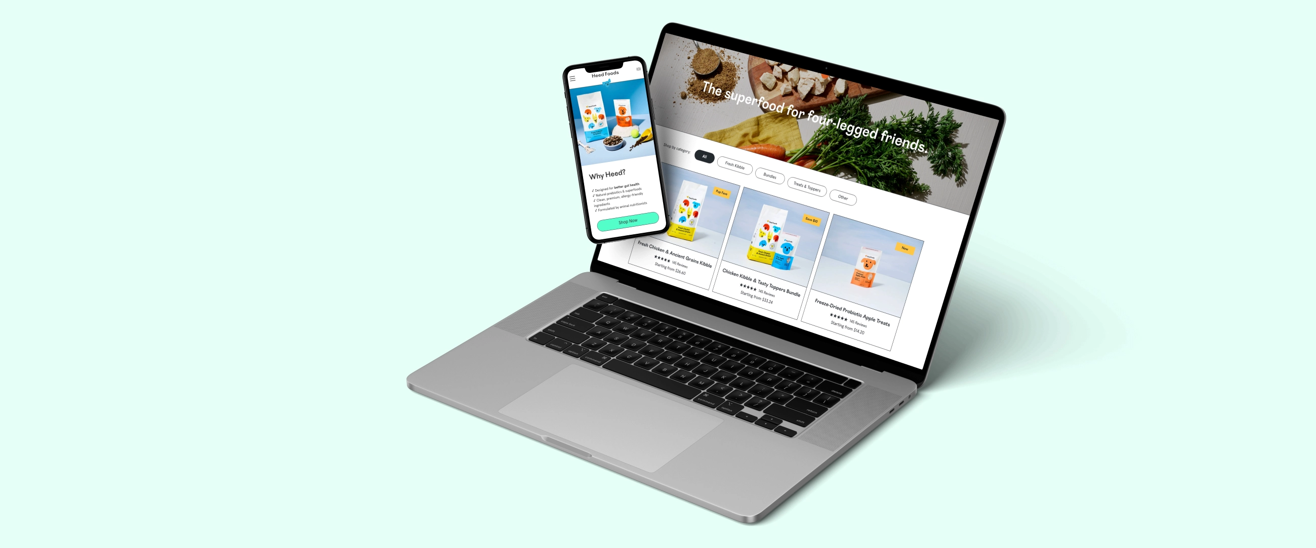
We concluded that the website needed to be simplified for better understanding and ease of use. This meant getting rid of everything that’s not essential—while still keeping the bright and whimsical personality of Heed Foods. We made sure all messaging and content was purposeful, easy on the eyes, and clearly communicated the brand’s mission + value.
Everything was designed to be modular and scalable.
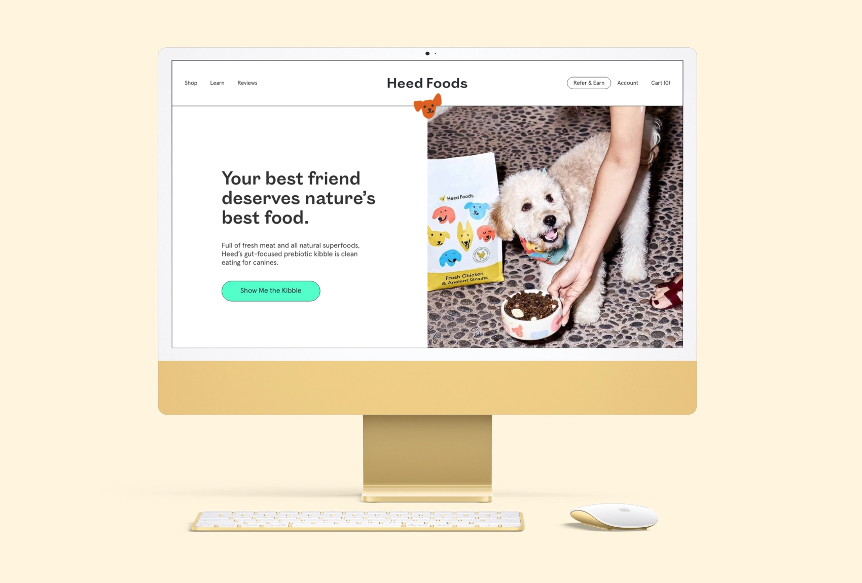
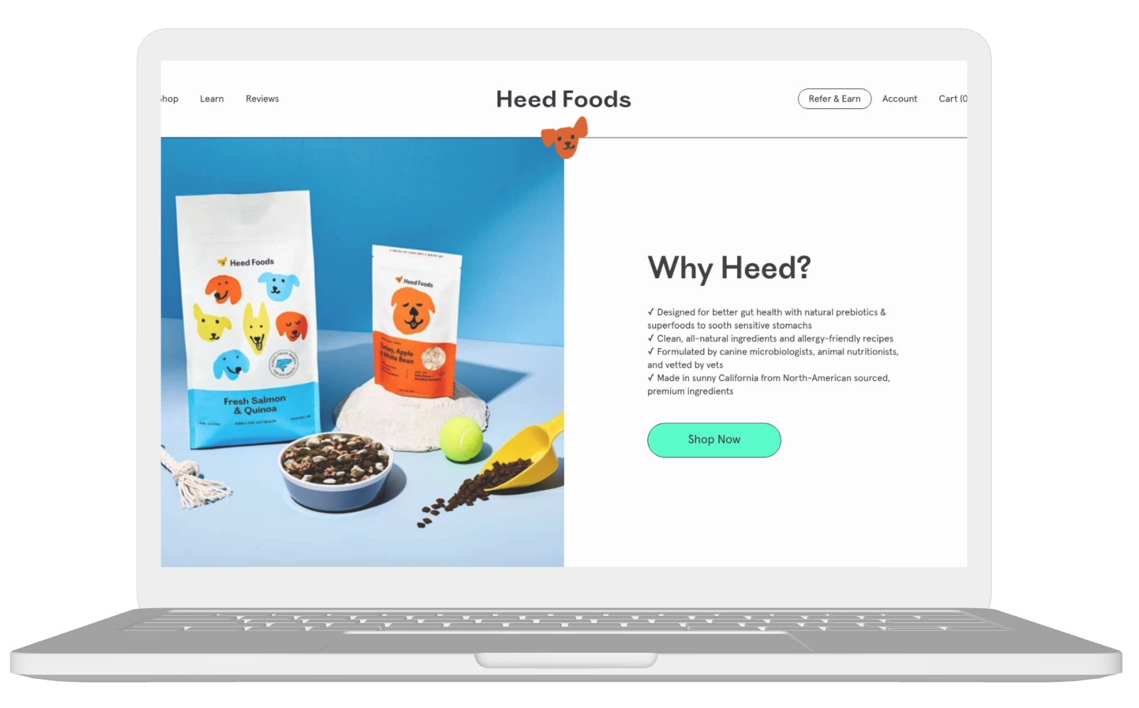
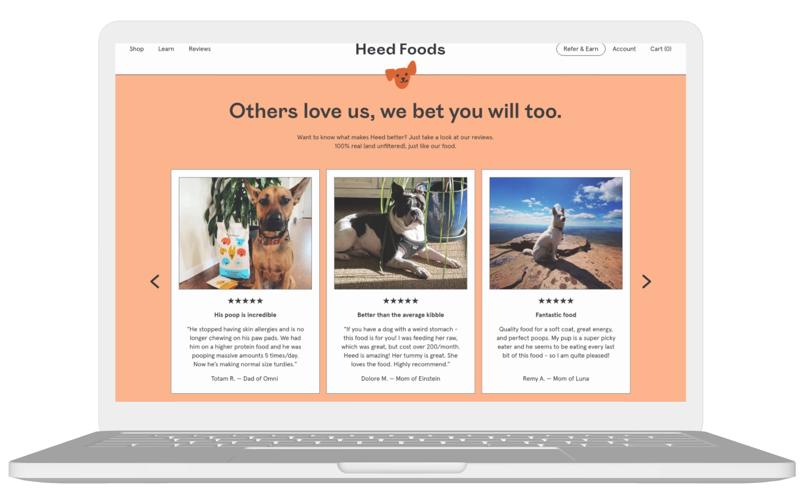
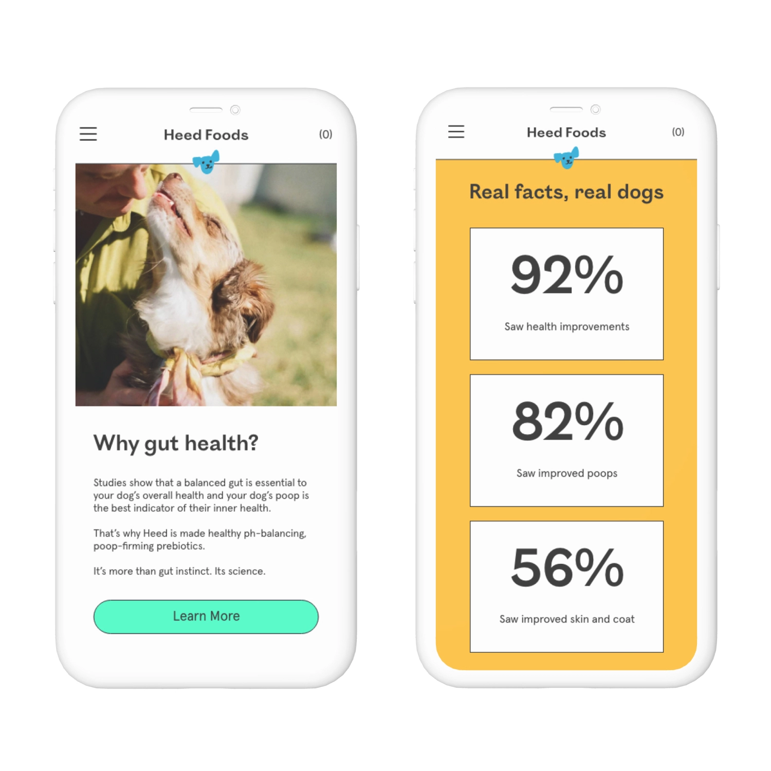
We designed the home page to tell the brand’s story in the most compelling way. What do users look for when shopping a new brand? Trust. So, we spotlighted customer reviews and data to showcase real results. We also trimmed copy to be punchy and concise, reduced visual clutter, and added sections that provided more value by addressing users’ common concerns/goals upfront.
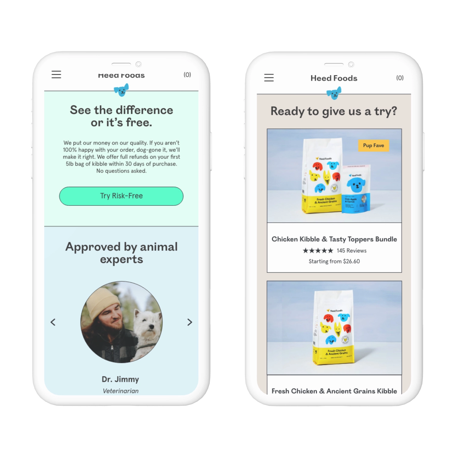
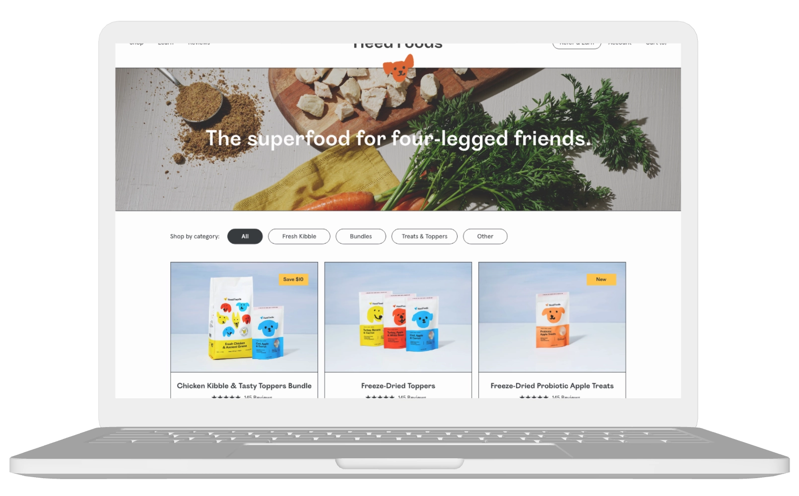
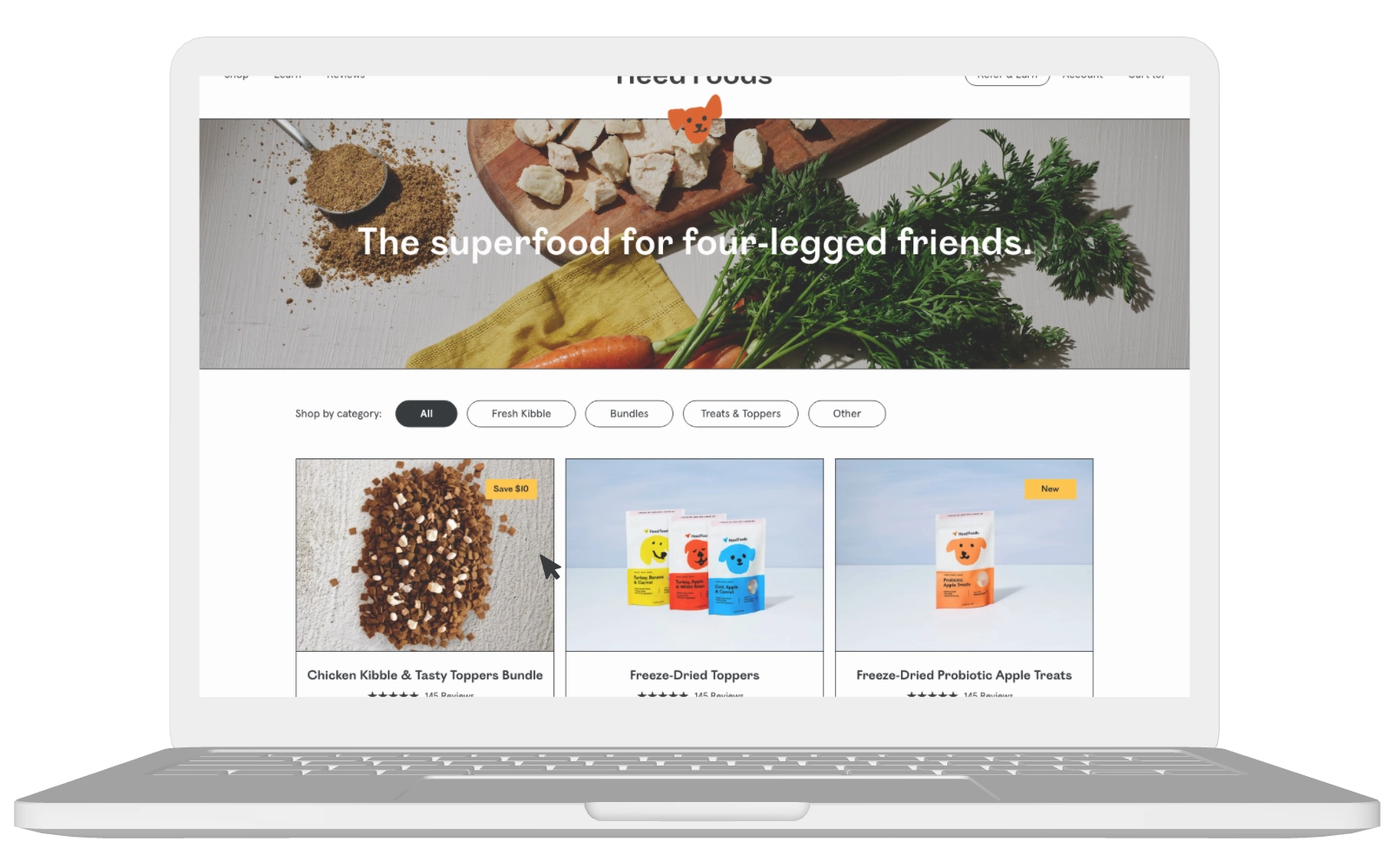
We elevated this page by reworking the layout, adding a hero banner, incorporating a filter function to easily shop by category, and improving the product tiles to make it easier to compare products at a glance.
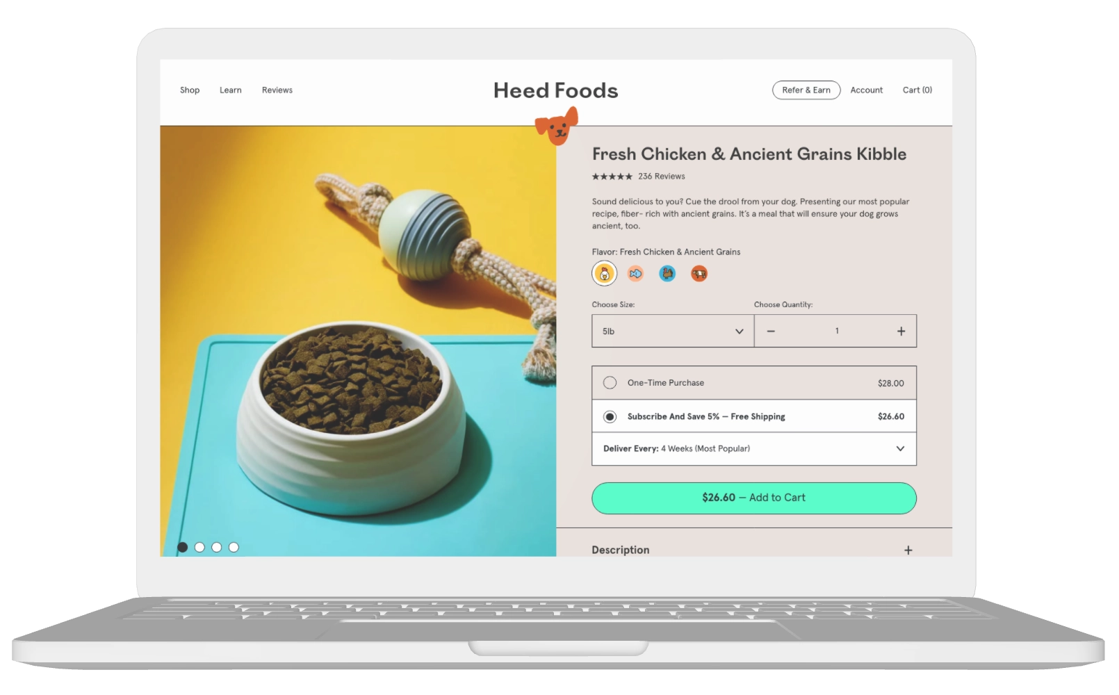
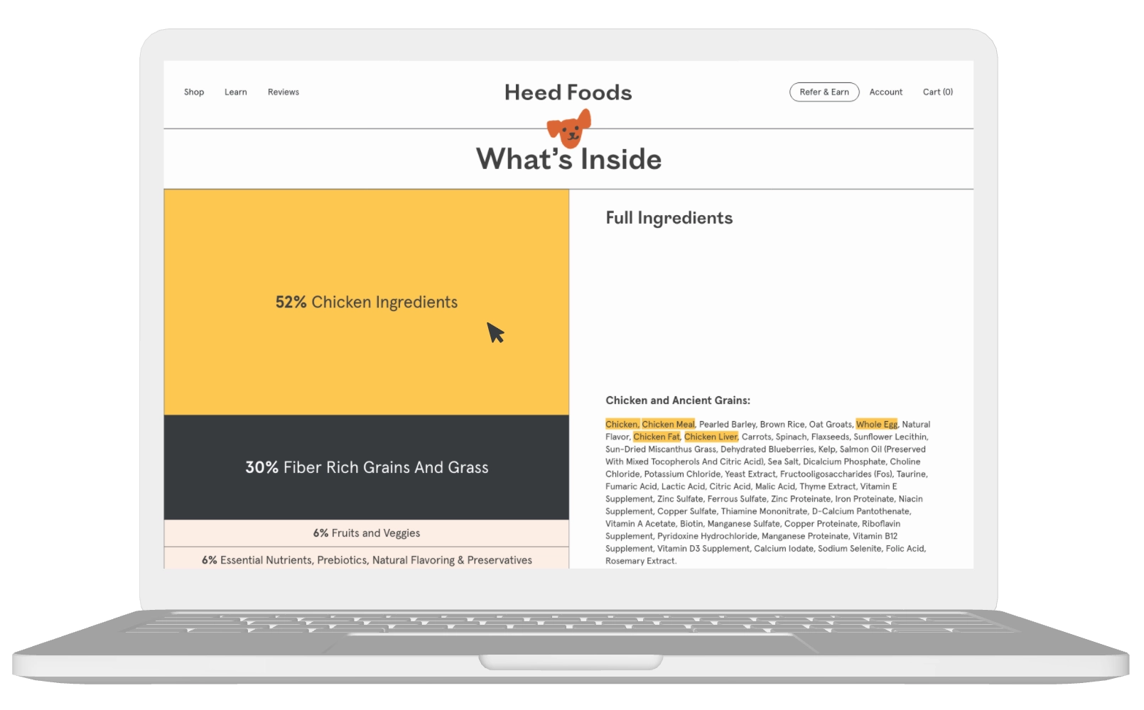
For the lengthiest (and arguably most important) page of the site, we designed the PDP to break down all the extensive information to read in the most user-friendly way. Chunking content into shorter, bite-sized pieces made the page more manageable and easy to absorb. Small adjustments in layout, hierarchy, and styling of sections helped to improve the overall usability of the page.
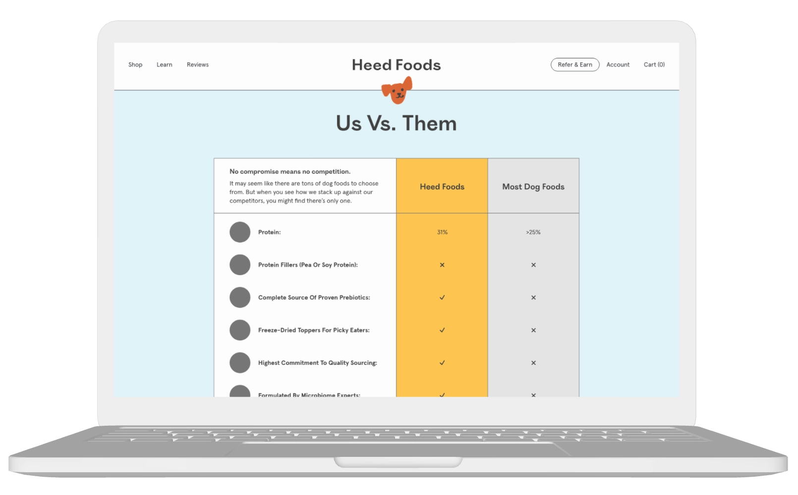
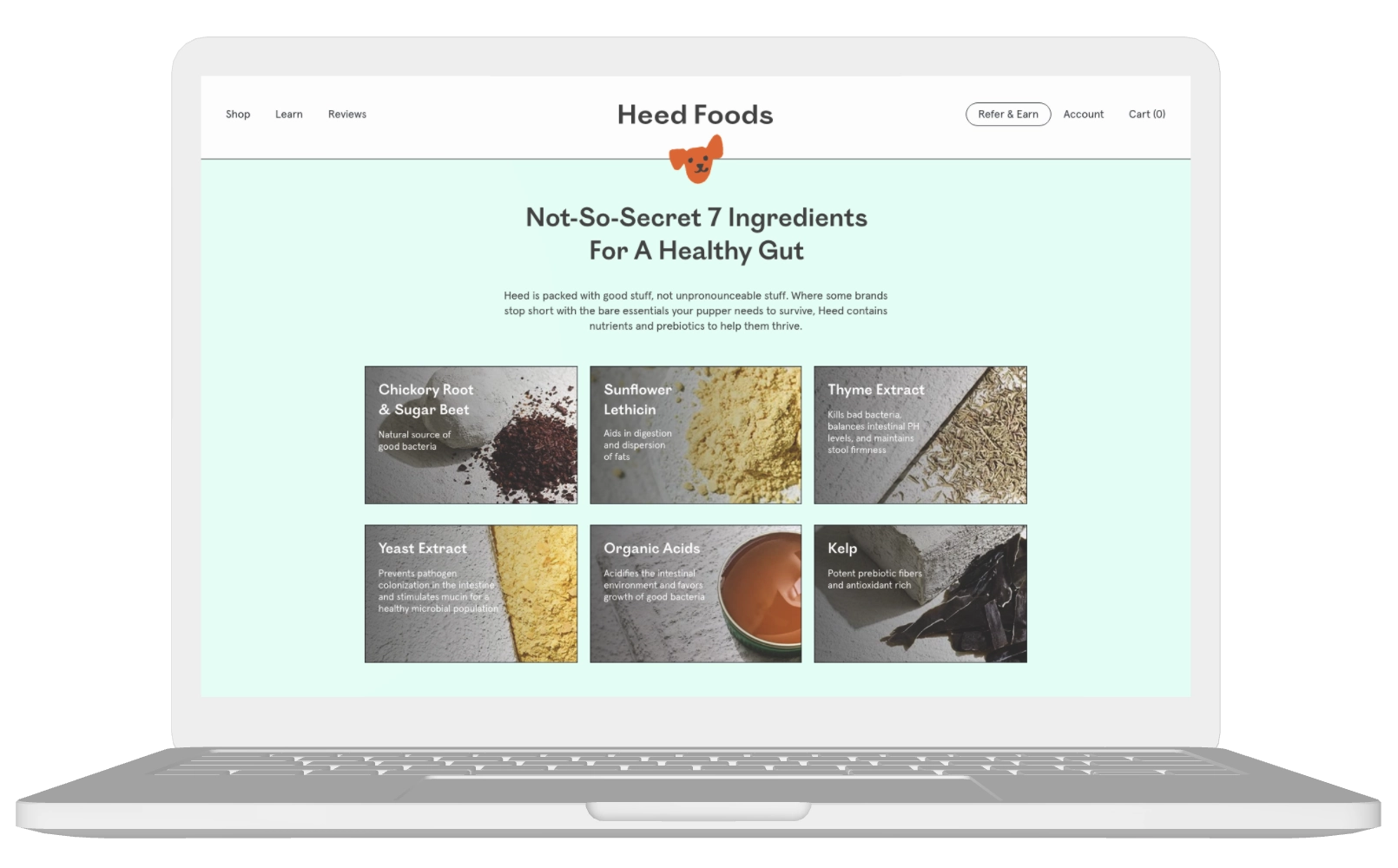
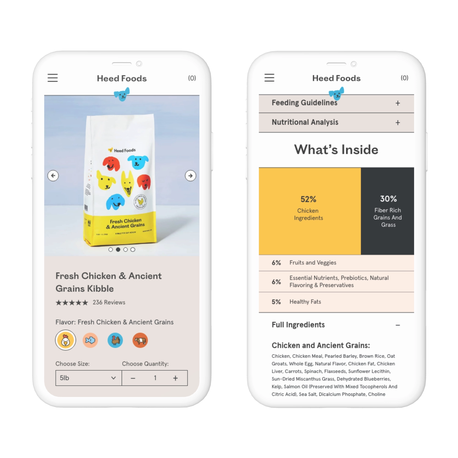
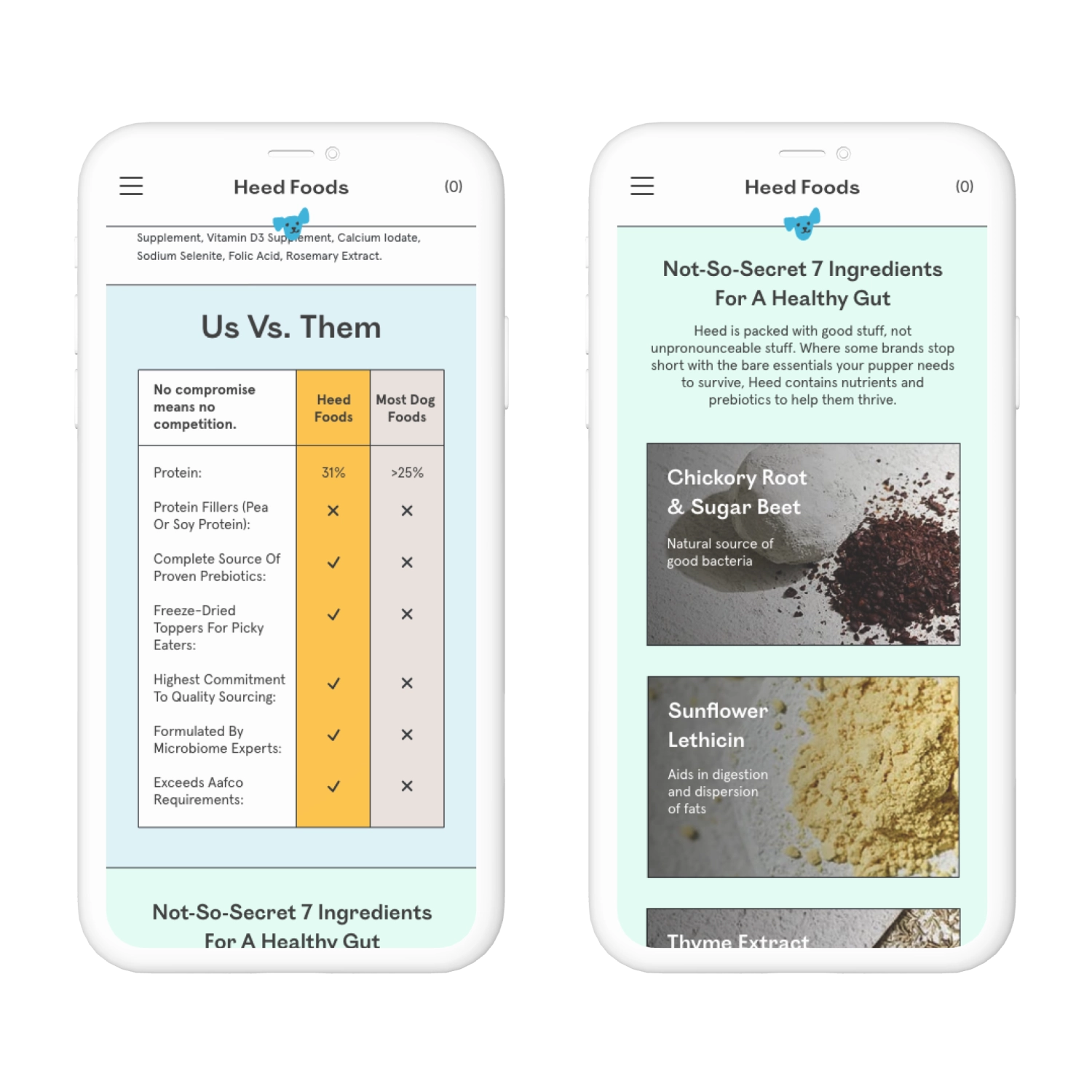
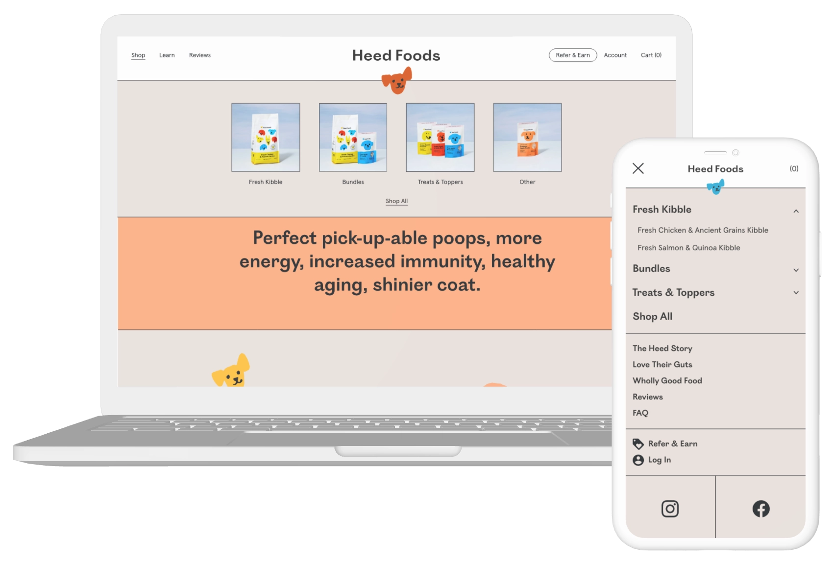
We improved the overall information architecture so navigating the website is more intuitive for users. On desktop, we added image thumbnails to better distinguish between each product collection. On mobile, we focused on enhancing the visual hierarchy by adding text treatments and drop-down drawers.
Rei Kawano, Founder & CEO
Melanie Han, Co-founder & COO
Carmela Ocampo, UX/UI Designer
Steph Huynh, UX/UI Designer


